
Fine Line vs Bold Line Tattoo: Which Style Lasts
You're in the tattoo studio with two reference images open on your phone. One is a whisper-thin botanical piece on a wrist. The other is a thick-lined traditional dagger with enough contrast to read across the room. You like both, so you ask the question almost every artist hears: Should I get a fine line or bold line tattoo?
The more useful question comes later. How will that line weight behave on your skin, in that placement, through your lifestyle, over the next five to fifteen years? A tattoo can look perfect in the mirror on day one and still be the wrong technical choice for a hand, ankle, rib, or shoulder.
Fine line offers delicacy, negative space, and an understated finish. Bold line offers stronger contrast, clearer shapes, and a more forgiving aging profile. Neither style wins everywhere. The right choice depends on placement, design, exposure, movement, aftercare, pain tolerance, and whether your artist consistently produces healed work in the style you want.
Table of Contents
Side-by-Side Comparison Across the Details That Matter - Fine Line vs Bold Line Tattoo at a Glance - What the chair experience feels like - Where each style earns its advantage
Best Placements for Fine Line and Bold Line Work - Areas that often support fine line - Areas where bold line is usually safer
A Simple Framework for Choosing Your Style - Start with the reason you want the tattoo - Test the placement against your real routine - Be honest about discomfort and session pace - Judge the artist by healed work
When the Choice Between Fine and Bold Feels Personal
A client usually arrives with an aesthetic preference before they arrive with a longevity plan. They point to a fine-line flower because it looks quiet and elegant, then to a traditional dagger because it has presence. Both references may be beautifully executed, but they ask different things of the skin.
A delicate botanical design needs enough space between leaves, stems, and interior details to remain readable after the tattoo settles. A dagger with a bold outline can tolerate more visual wear because its identity comes from strong silhouettes and high contrast. The decision isn't only about whether you prefer subtle or dramatic artwork. It's about how much room the design has to change before it stops looking intentional.
Practical rule: Choose the line weight for the tattoo you want to live with, not only the photograph you want to post on the day it's finished.
Fine line tattoos are often selected for professional discretion, personal symbolism, or a drawn-on-skin feeling. Bold work suits clients who want their tattoo to remain visible, graphic, and legible from a distance. A hybrid design can also make sense, especially when a stronger outer contour protects a delicate interior.
Placement changes the conversation immediately. A fine line that behaves beautifully on a protected inner arm may struggle on a finger exposed to washing, friction, and constant movement. A bold design that works on a shoulder or upper arm may feel too heavy for a tiny sternum symbol.
Your artist should also ask about sun exposure, work conditions, exercise, skincare, and how much maintenance you'll accept. Aftercare matters, but it can't completely override poor spacing, an unsuitable placement, or a line weight that doesn't match the design.
The most honest consultation doesn't promise that either style will remain frozen in time. It explains what each style gives you now, what it may ask of you later, and where the compromises are unavoidable.
What Defines Fine Line and Bold Line Tattoos
Fine line tattoos use a single needle or a very small round liner grouping to produce precise, delicate marks. Common configurations include 1RL, 3RL, and 5RL, although practical guidance often places the more dependable outline range around 3RL to 5RL because a 1RL deposits very little ink and can heal lighter or lose readability sooner. Technical guidance on fine-line needle choices explains why the smallest needle isn't automatically the best choice for long-term clarity.
The visual result is airy. Fine line relies on controlled hand movement, restrained saturation, negative space, and careful sequencing. It works especially well for botanical stems, small illustrative drawings, subtle lettering, constellations, and designs where the absence of heavy ink is part of the composition.
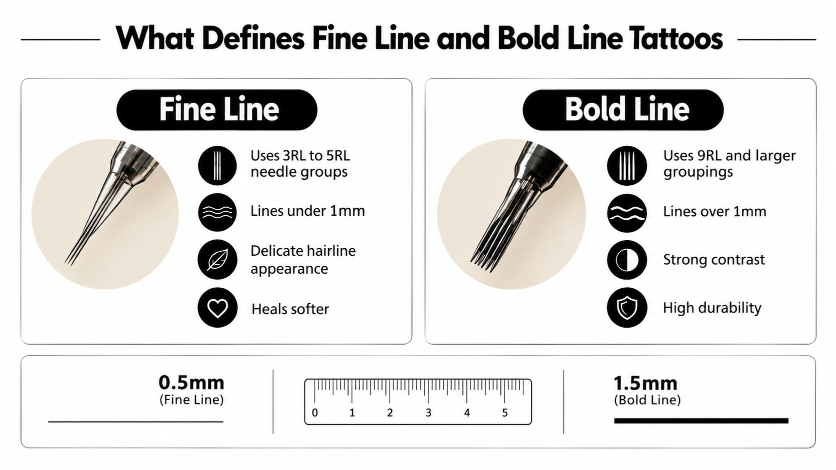
Bold line tattoos use larger liner groupings and more saturated passes to create strong outlines. Their history is closely tied to early American Traditional tattooing, which combined military, maritime, and Americana imagery with thick contours designed to keep forms readable as skin changes. This history of bold-line American Traditional work describes the practical purpose behind that visual language.
Bold line isn't just “fine line made thicker.” The artist designs differently from the start. Shapes become simpler, contrast becomes more deliberate, and details need enough separation to support the main silhouette. Anchors, roses, daggers, animals, lettering, geometric blackwork, and large graphic motifs naturally benefit from that approach.
Fine line's modern form is widely traced to California in the 1970s, when Chicano artists in East Los Angeles developed single-needle and tight needle-grouping techniques. A frequently cited milestone is 1975, when Charlie Cartwright and Jack Rudy opened Good Time Charlie's, a studio associated with developing the style into a more established professional practice. A history of fine-line tattooing places that development within the transition from prison and street-based improvisation to studio-standard technique.
The machine, needle, hand speed, voltage, skin stretch, and depth all affect the result. A competent artist won't choose a needle solely because a reference image looks thin. They'll choose a configuration that gives the design enough ink and spacing to heal with purpose.
Side-by-Side Comparison Across the Details That Matter
The phrase fine line vs bold line tattoo sounds like a simple style debate, but clients usually care about several practical differences at once. Use the table as a starting point, not a guarantee. Artist technique and placement can change the experience.
Fine Line vs Bold Line Tattoo at a Glance
Factor | Fine Line Tattoo | Bold Line Tattoo |
|---|---|---|
Visual character | Delicate, quiet, detailed, and open | Graphic, high-contrast, prominent, and readable |
Typical needle approach | Single needles or small groupings such as 1RL, 3RL, or 5RL | Larger liner groupings and more saturated passes |
Pain sensation | Often sharper and more focused, with less heavy packing | Often feels like sustained pressure during stronger saturation |
Design tolerance | Needs careful spacing and simplified detail | Handles stronger silhouettes and broader shapes |
Healing appearance | May settle softer and lighter | Usually retains a clearer graphic structure |
Placement strengths | Protected, stable areas with enough room for separation | High-friction, exposed, or visually demanding areas |
Maintenance | May need more frequent assessment and refreshes | Often offers a more forgiving aging profile |
Best visual distance | Close viewing and intimate detail | Close viewing and distance readability |
What the chair experience feels like
Pain is individual, so no ethical artist should promise that one style will be painless. Fine line can feel sharp because the needle is precise and the artist may work slowly through small details. Bold work can feel heavier when the artist packs ink or reinforces a strong outline.
Healing also depends on how the skin was worked, the location, your immune response, and your aftercare. Fine-line tattoos can look lighter or softer as the surface settles. Bold work may look visually intense during healing, then stabilize into a clearer graphic field.
Where each style earns its advantage
Fine line wins when you want subtlety, fine detail, and a design that doesn't dominate the body part. Bold line wins when long-distance readability and visual resilience matter more than whisper-level delicacy.
A mixed approach can solve a design problem. A bold outside contour can protect the identity of a flower or animal, while fine interior marks add texture. That only works when the artist leaves enough room for the two systems to age without crowding each other.
How Each Style Actually Ages on Real Skin
Fresh ink is a poor predictor of final appearance. The surface may heal in roughly 2–4 weeks, while deeper settling can continue for up to 2 months, according to guidance on healed spacing and line readability. Fine-line elements can appear slightly thicker and softer once the skin finishes regenerating.
Ink placement matters because the artist works within a narrow depth window. Technical discussion places a useful tattooing depth around 1.0–2.0 mm, with shallow application fading quickly and overly deep application increasing the risk of blur or scarring. The ongoing discussion of fine-line longevity and needle depth makes the central point clear: precision isn't just about drawing a thin line. It's about depositing ink at the right depth without damaging the skin.
Fine line has less visual margin for diffusion. A tiny leaf, a closely spaced script letter, or a delicate facial feature can lose its identity when the surrounding skin softens. Bold outlines begin with more visual mass, so modest diffusion doesn't necessarily destroy the shape.
Time After Healing | Fine Line Condition | Bold Line Condition | Touch-Up Likelihood |
|---|---|---|---|
After the initial surface healing | Often looks softer and lighter than fresh ink | Strong outlines generally remain visually forceful | Depends on healing and artist assessment |
Around 3–6 months | A useful point for judging healed clarity | Structure is usually easy to evaluate | Fine line may be reviewed more closely |
Over 3–5 years | Exposed placements may show fading, spreading, or lost micro-detail | High-contrast forms often remain readable, though exposure still matters | Refresh needs vary by placement and care |
Around 10–15 years | Diffusion and skin changes can further soften delicate marks | Bold shapes may still read well, with fading and softening possible | Both styles may eventually benefit from maintenance |
Placement controls the timeline more than many clients expect. Guidance on tattoo aging notes that exposed areas such as hands and neck may need refreshes in roughly 3–5 years, while protected areas can hold detail for up to about 10 years. This placement-focused overview of fine-line aging also highlights the particular risks to fine detail, including line spread and placement mistakes.
For a broader discussion of how black tattoo styles differ from color work, see black tattoos versus color tattoos. The relevant lesson here is simple: ink choice, exposure, line weight, and design structure all interact. No line style remains untouched by skin biology.
Best Placements for Fine Line and Bold Line Work
Placement should be treated as a technical decision, not a final decorative detail. Skin movement, friction, sun exposure, body contours, and the amount of space available all influence how a line-weight choice performs.
Areas that often support fine line
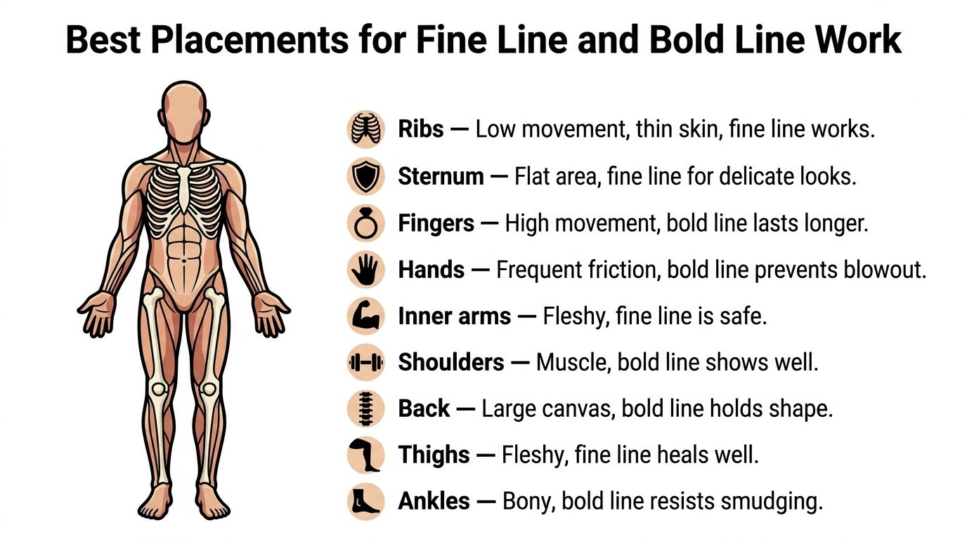
The inner arm is a reliable setting for delicate script, small botanicals, and restrained line art because it offers relatively stable, fleshy skin with less direct friction than the hands. The ribs and sternum can also suit fine work when the design has enough breathing room, although ribs bring a more uncomfortable tattooing experience for many clients because the skin sits close to bone.
Shoulder blades offer a broad, relatively stable canvas. Both styles can work there, so the decision usually comes down to whether you want an intimate drawing or a stronger graphic piece. Thighs provide substantial working space and fleshy coverage, which can support fine detail when the composition isn't compressed into a tiny footprint.
Ankles are more complicated. They can carry fine line when the design is simple and well spaced, but bony contours, footwear, and movement make heavier outlines a sensible option for designs that need clear edges.
Areas where bold line is usually safer
Fingers and hands experience repeated washing, friction, movement, and sun exposure. Fine-line finger tattoos may look elegant at first, but the location gives delicate detail little protection. Bold, simplified shapes generally have a better chance of staying legible, though no hand tattoo is maintenance-free.
The same logic applies to feet and parts of the ankle that rub against shoes. A bold line won't prevent all fading, but it gives the design more visual weight to lose before the image becomes unclear.
Back pieces and larger shoulder compositions can use either line weight, but bold work often holds the structure of a large image more effectively. Fine line across a large area needs disciplined composition, consistent spacing, and an artist who understands how small details behave when viewed as part of a larger design.
The most important question is not whether a placement is fashionable for fine line. Ask whether the skin will repeatedly experience sun, friction, stretching, or movement, then adjust the line weight and design accordingly.
Matching Design Concepts to the Right Line Weight
Design intent should determine line weight before the stencil reaches your skin. Fine line and bold line aren't interchangeable filters. They create different visual hierarchies, so forcing a concept into the wrong system usually produces a compromised tattoo.
Fine line naturally supports:
Single-needle florals: Stems, petals, and botanical contours can stay light when the design has generous negative space.
Fine script lettering: Small lettering needs careful sizing and spacing, not just the thinnest available needle.
Minimalist line art: A continuous contour or reduced illustration benefits from restraint.
Dot-work and delicate constellations: Small marks can create texture without turning the tattoo into a solid graphic block.
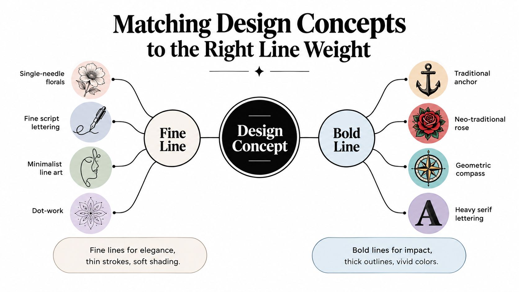
Bold line suits concepts that depend on silhouette and contrast:
American Traditional flash: Anchors, roses, daggers, eagles, and other classic motifs need a strong contour to keep their identity.
Japanese-inspired compositions: Large outlines help organize figures, flowers, and background elements across the body.
Geometric blackwork: Clean, saturated borders make repeated shapes easier to read.
Heavy lettering and tribal-inspired patterns: Thick forms provide the impact these designs are built to deliver.
A hybrid approach sits between those categories. The artist may use a stronger exterior line around a figure, then add fine hatching, small texture marks, or restrained interior shading. That gives the image structure without abandoning detail.
The failure usually starts when the client asks for a highly detailed realistic image at a size that only allows a few crowded marks. Another common mistake is rendering a heavy traditional subject with a single-needle pass because the reference image looks delicate on a screen. The concept still needs an outline that can carry its visual weight.
If your idea involves cosmetic tattooing rather than body art, the technical conversation changes. A resource on Bonna Beauty eyeliner tattooing is more relevant to permanent eyeliner questions than a body-tattoo line-weight comparison.
For additional inspiration, browse simple line-work tattoo ideas, then bring references that show the type of composition you want rather than only a single finished image.
A Simple Framework for Choosing Your Style
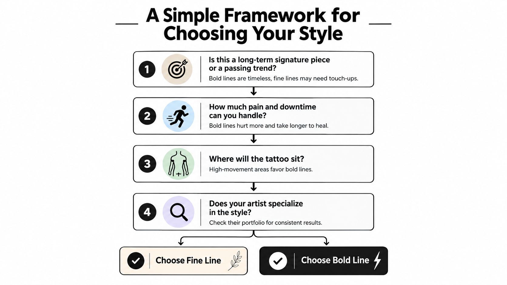
Use four checkpoints before you commit. They keep a beautiful reference image from making the decision for you.
Start with the reason you want the tattoo
Ask whether this is a long-term signature piece, a private symbol, a collection addition, or an experiment with a current aesthetic. If the tattoo needs to remain readable and visually assertive for years, bold line gives you more tolerance. If subtlety is central and you're comfortable with future assessment or maintenance, fine line may fit better.
Test the placement against your real routine
Look at the exact body area, not a generic body map. A protected inner arm has different demands from a hand, even if both are close to the same size. Consider sun, clothing friction, repeated washing, exercise, and how the skin folds when you move.
Be honest about discomfort and session pace
Fine line isn't automatically easier. A small piece may be quick, but detailed work can require slow, deliberate passes. Bold outlines may finish efficiently on a simple design, while saturated packing can feel more intense. Your artist should explain the expected process for your specific tattoo rather than assigning a universal pain ranking.
Judge the artist by healed work
Fresh social media photos show clean stencils, bright contrast, and controlled lighting. Ask to see healed tattoos in the same style and on comparable placements. Look for spacing, line consistency, retained detail, and whether the artist recommends adjustments instead of agreeing to every request.
Before booking: Bring your preferred reference, a backup concept, and the exact placement you're considering. A strong artist can then explain what should be enlarged, simplified, reinforced, or relocated.
Your choice may become clear after those questions. If the placement is exposed and high-friction, your design relies on distance readability, and you don't want routine refresh discussions, bold line is the more practical recommendation. If the location is stable, the composition has breathing room, and delicacy matters most, fine line may be the right compromise.
Putting It All Together and Booking With Confidence
The choice between a fine line vs bold line tattoo is really a choice about aging, placement, and design tolerance. Fine line gives you an understated, detailed result on day one, but it demands careful spacing, disciplined technique, suitable placement, and realistic maintenance expectations. Bold line delivers contrast and durability, though it can limit how much tiny detail a design can carry.
Neither approach is automatically more professional, more meaningful, or more attractive. The right answer depends on your body area, exposure, movement, concept, and willingness to accept future softening or refresh work. Your artist's healed portfolio matters more than a style label.
If you're researching how to evaluate an artist specifically for delicate work, use this guide to find a fine-line tattoo artist and compare healed examples before you request a booking.
Bring reference images to a consultation, but also bring questions about spacing, line weight, placement, healing, and what the tattoo may look like years from now. Ask for a design recommendation that respects your skin and routine, not just the reference image.
Think Tank Tattoo offers custom consultations in Denver for clients weighing fine-line and bold-line approaches, with artists working across varied styles and placements. Visit Think Tank Tattoo to discuss your concept, review the right artist's portfolio, and book a consultation focused on both the day-one design and its long-term readability.
Comments