
Grey Ink Tattoos: 7 Styles, Techniques, and Aftercare Tips
Grey ink tattoos can look soft without being designed to disappear, but grey isn't a standardized pigment. It's generally made by diluting black pigment with a carrier, and its composition depends on the pigment, dilution, and additives, as described in an analytical survey published in Contact Dermatitis. A lighter-looking shade doesn't automatically mean simpler chemistry or more predictable aging.
That distinction matters when you're choosing between a detailed portrait and a barely-there floral wash. Both use grey, but they need different amounts of dark shading, open skin, and separation to remain readable after healing and years of wear. The strongest design isn't necessarily the darkest one. It's the one with enough contrast for its size and placement.
The styles below range from smooth realism to textured dotwork and shadowed lettering. For each, consider what creates the effect, which details can become less distinct, and what to ask during your consultation. Bring reference images, but stay open to changes in scale. A drawing that works on paper may need more breathing room on skin.
Table of Contents
1. Black-and-Grey Realism
A memorial portrait needs to remain recognizable after its lightest shading softens. That means the artist can't rely entirely on tiny eyelashes, pale cheek gradients, or individual strands of hair. The larger shapes of the eyes, nose, mouth, and shadows must work first.
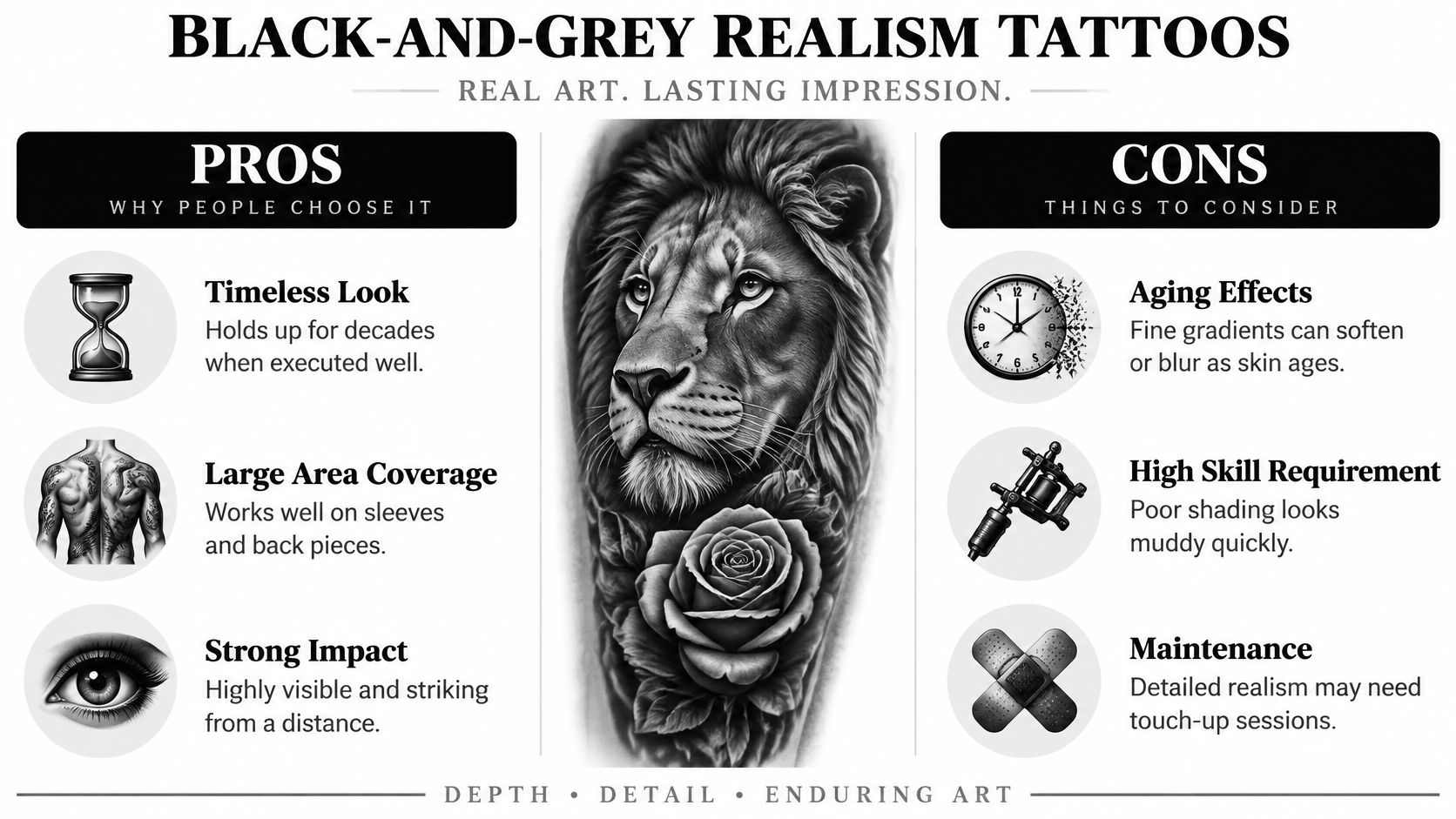
Black-and-grey realism uses graduated washes to describe form rather than outlining every edge. An upper-arm portrait, a wildlife piece on the thigh, or a full sleeve can give the artist room to separate those tonal shapes. Bring photographs with clear lighting, not heavily filtered images with flattened shadows.
This comparison illustrates the balance between detail and contrast.
Ask About the Healed Portrait
When reviewing a black-and-grey tattoo artist's portfolio, look beyond fresh photographs. Ask for healed examples with similar detail, placement, and skin tone.
Shadow structure: Which areas will remain dark enough to define the subject if the pale washes soften?
Scale: Does the face need to be larger to preserve the eyes and mouth?
Follow-up: When should the healed tattoo be assessed, and what would justify a touch-up?
Smooth shading requires controlled application, not endless passes through irritated skin. Don't ask an artist to keep darkening a fresh portrait because redness makes the values difficult to judge.
Practical rule: Choose recognizable structure over photographic detail that only works at close range.
Touch-ups should address an assessed need after healing, not serve as a substitute for a readable original design.
2. Whip Shading
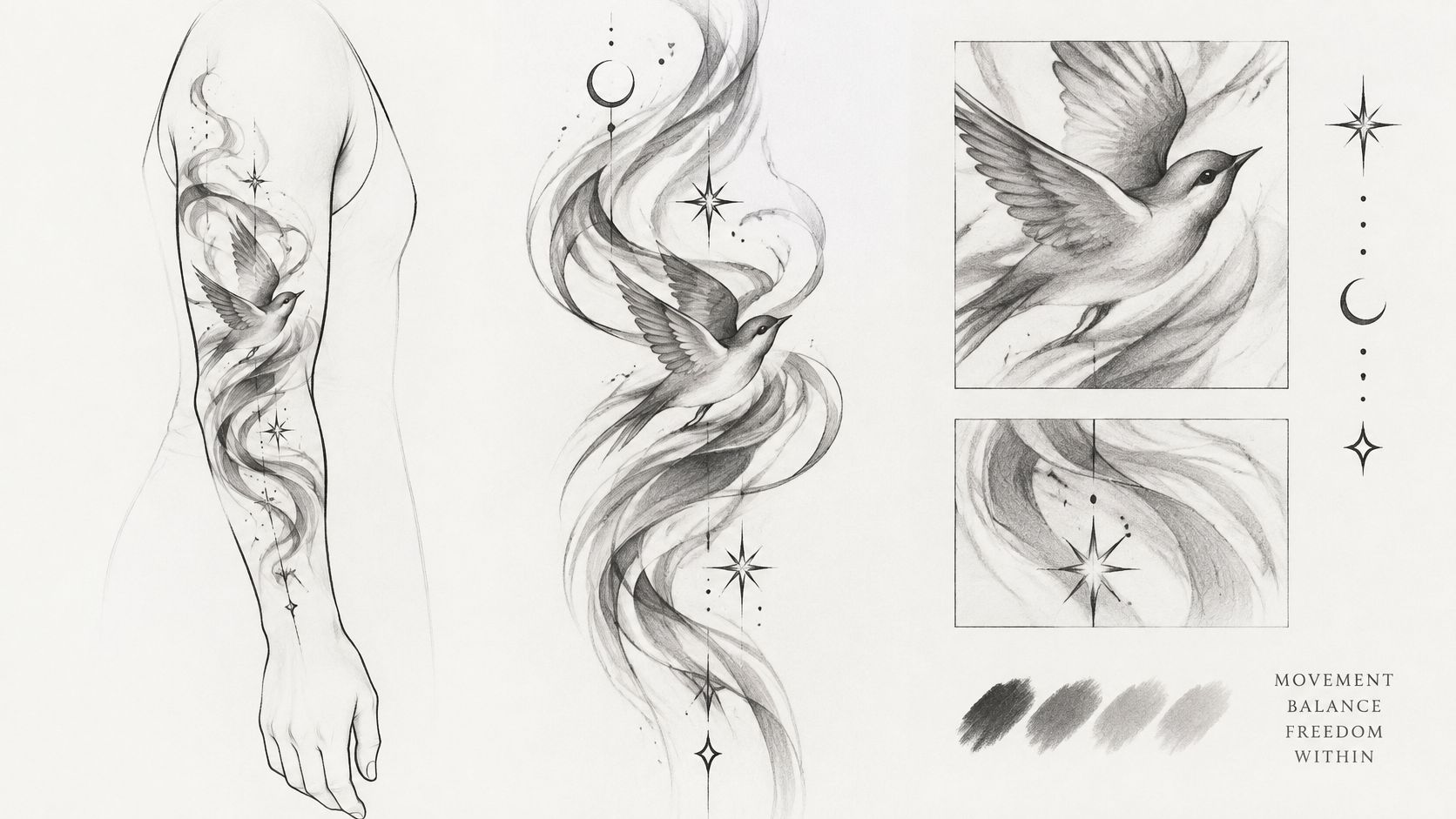
Whip shading creates texture rather than a smooth gradient. The artist moves the needle through controlled flicking strokes, leaving a darker beginning that tapers into scattered marks. That directional texture suits smoke, feathers, fur, and folds of fabric.
A bird surrounded by moving smoke is a useful design example.
For a wolf on the outer arm, the artist might use darker strokes near the neck and lighter, more open texture toward the surrounding skin. The direction should follow the animal's form. Random flicks can make the surface look scratchy without explaining the fur or anatomy.
Leave Room Between the Strokes
Closely packed marks can become less individually distinct as the tattoo settles and ages. Enough open skin between textured areas matters more than making every stroke extremely fine. A sweeping background also needs space, which makes a sleeve, thigh, or back easier to compose than a cramped wrist design.
This video provides a visual reference for discussing the technique.
Ask your artist where the whip shading will begin, where it will fade out, and which edges must remain distinct. For smoke behind a skull, the skull should still read clearly without depending on the lightest background strokes.
Don't mistake every visible mark for uneven application. A deliberately textured finish is different from smooth realism. Review healed examples so you're choosing that texture knowingly, rather than expecting a soft photographic blend.
3. Grey Wash Watercolor
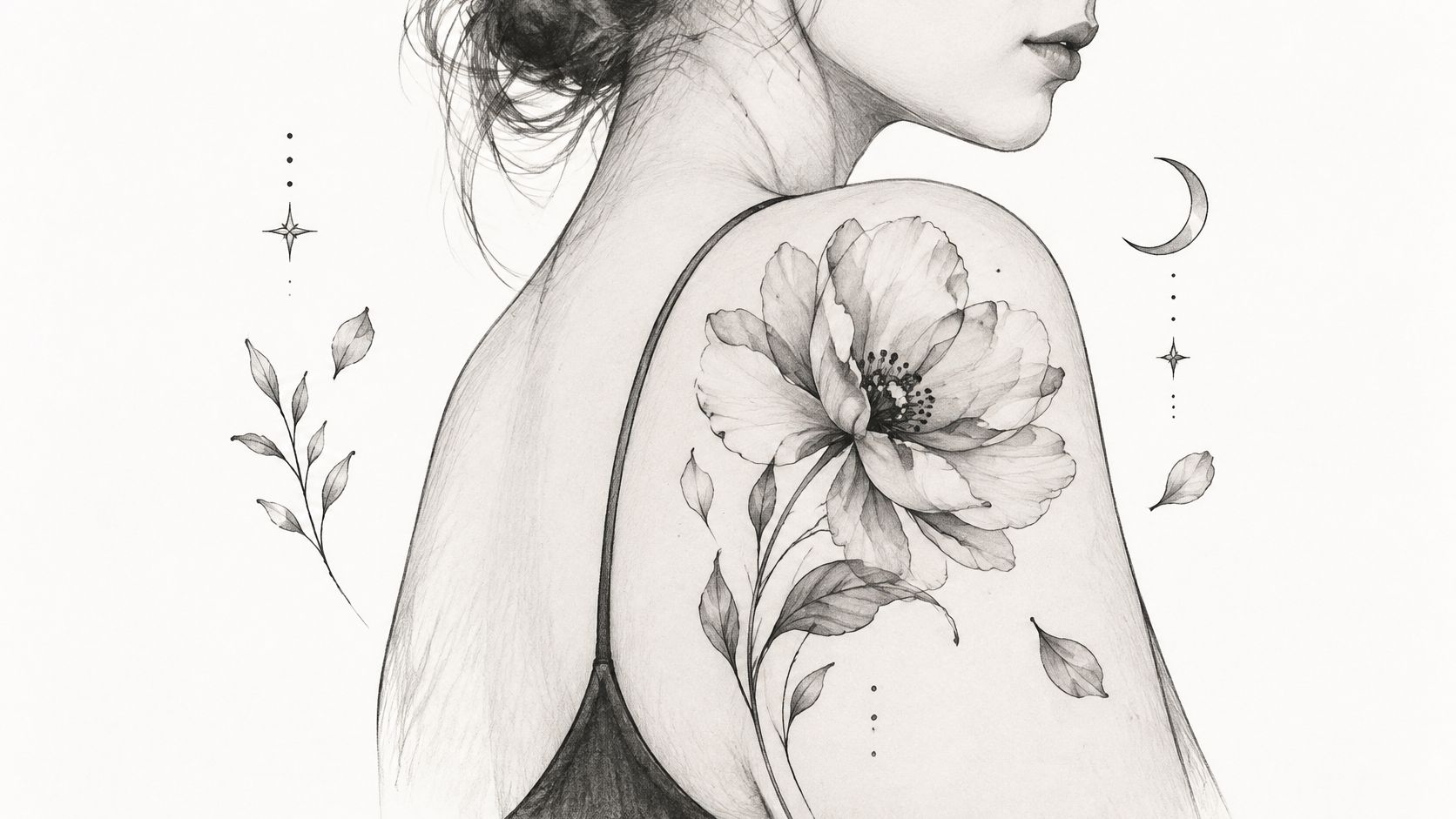
Grey wash watercolor suits clients who want the appearance of brushed ink: loose petals, misty mountains, and irregular pools of tone. Its softness is also its main longevity trade-off. When a design depends almost entirely on pale edges, even modest changes in contrast can alter its appearance.
A floral shoulder composition shows the kind of open, painterly arrangement that suits this approach.
The FDA's tattoo and permanent makeup fact sheet confirms that tattoos can fade and that pigment placed at too great a depth can migrate, producing a blurred appearance. That doesn't establish a universal lifespan for grey wash. It does make promises of permanently crisp, barely visible gradients unrealistic.
Keep a Recognizable Core
For a mountain scene, retain a readable ridge or darker foreground rather than shading every feature equally lightly. For florals, give selected petal overlaps enough depth to distinguish the blooms.
A watercolor tattoo design doesn't need a heavy outline around everything, but it does need visual structure.
Edge definition: Which edges will stay clear, and which are intentionally diffuse?
Placement: Would the upper arm or back give the composition more usable space?
Maintenance: If the palest areas soften, would you still like the design without refreshing them?
Choose a wash you'll enjoy when it looks softer, not one that only works when every pale mark stays unchanged.
Don't treat repeated refresh sessions as guaranteed maintenance. Each decision to add pigment should follow a review of the healed skin and the design's remaining contrast.
4. Dotwork and Stipple Shading
Dotwork produces a grey impression through the density of individual dots, even when the artist uses black ink. Dense clusters look darker; widely spaced dots leave more visible skin. That's different from creating every grey value with diluted ink.
A mandala on the upper back can use dense dotwork near the center and increasingly open shading toward the outer petals. A stippled skull might use concentrated dots beneath the cheekbone while leaving the forehead relatively open. In both cases, spacing creates the form.
The appeal is texture. The limitation is that tiny dots and narrow gaps shouldn't be designed as though they'll remain identical to a fresh close-up photograph.
Judge the Pattern at Normal Viewing Distance
Our dotwork tattoo style guide can help you identify the kind of texture you want before discussing the actual composition. During consultation, ask the artist to explain how the pattern will remain readable when viewed from across a room.
Dot spacing: Where does the design need open skin instead of additional shading?
Symmetry: How will the stencil sit when you stand naturally, rather than twist toward a mirror?
Scheduling: How will the artist divide detailed work into manageable appointments?
Don't choose dotwork because you assume it's automatically lighter or easier on the skin. Application and coverage still matter, and dense stippling requires careful work.
For geometric forearm pieces, inspect the stencil with your arm relaxed and rotated. A pattern can align beautifully from one angle while wrapping awkwardly from another. Let the artist adjust the geometry to your anatomy rather than forcing a flat reference image around the limb.
5. Japanese Sumi-e Grey Wash
Sumi-e-inspired tattooing draws on the appearance of ink painting: brushlike shapes, tonal variation, and deliberate empty space. Japanese tattoo backgrounds can also use grey clouds, waves, and mist, but a sumi-e-inspired composition and traditional irezumi aren't interchangeable labels. Discuss the visual tradition you want.
For a dragon moving through mist across the back, the grey should help separate the body from the background. If every cloud, scale, and shadow receives a similar mid-grey value, the result becomes difficult to read.
Large placements allow the artist to balance those masses. A sleeve needs transitions around the elbow and inner arm, not just an attractive outer-arm view.
Plan the Whole Composition
Multi-session grey work benefits from consistent records of the inks and washes used. That's a practical reason to discuss product documentation before starting a sleeve, rather than treating each appointment as an unrelated tattoo.
Ingredient names aren't a perfect guarantee of composition: a laboratory analysis published in the Journal of Environmental Health found that the declared pigment PO13 wasn't detected in either of the tested grey or green inks. That limited finding supports asking for traceability, not assuming every label is inaccurate.
Bring these questions to the design discussion:
Visual context: Is this brush-painting-inspired work, a traditional Japanese composition, or a deliberate combination?
Negative space: Where will uninked skin separate the main subject from clouds or water?
Session planning: How will the artist preserve the same tonal hierarchy across the piece?
Restraint usually serves this style better than filling every gap. Leave enough room for the subject's silhouette to remain readable as the finer washes become less prominent.
6. Ornamental Greywork Lace
A lace-patterned forearm piece can look intricate without making every opening microscopic. Ornamental greywork combines linework, repeating shapes, and grey recesses to suggest filigree, fabric, or antique engraving. The uninked openings are as important as the shaded threads.
Use a design sheet to identify motifs you like, then let the artist redraw their proportions for your placement.
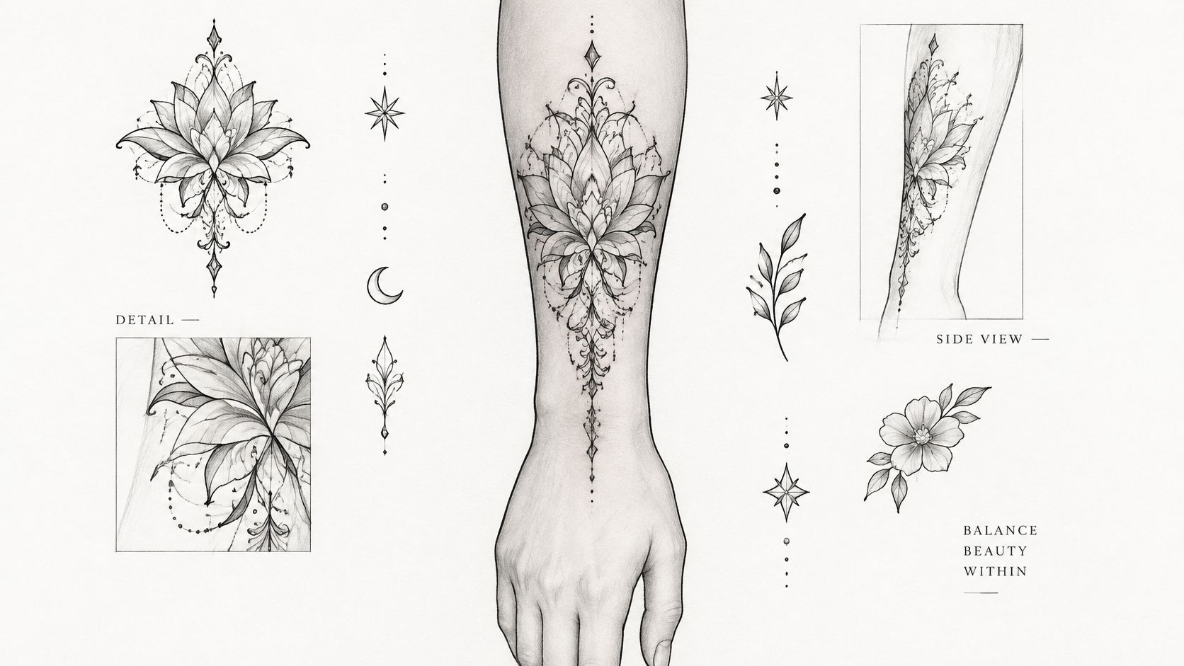
For a shoulder ornament, larger repeated forms can establish the overall shape while smaller details remain secondary. On the sternum, the artist needs to account for posture and the body's centerline. Perfect symmetry on a flat drawing doesn't guarantee a balanced result on the body.
Protect the Gaps
Ask to see the stencil at its intended size, not just enlarged on a screen. If the lace only reads when you lean close, simplify it or increase the scale.
Design priority: Preserve clear openings before adding another layer of decorative detail.
Also establish what the grey contains. A commercial tattoo-ink analysis discussed in a clinical review describes ingredient-disclosure gaps and potentially concerning adulterants. A cool grey, warm grey, or opaque grey may involve different formulations; the shade name isn't an ingredient list.
Ask which brand and shade will be used, whether batch information is available, and whether the formula includes white or other modifying pigments. Disclose relevant pigment, cosmetic, metal, and medical allergies before tattooing.
For longevity, don't shade every lace opening. A consistent dark-to-light hierarchy and generous skin gaps will preserve the ornamental pattern better than uniformly delicate detail.
7. Grey Ink Lettering with Soft Shadow
Lettering has to read before its shadow looks impressive. Grey can add depth behind a name, date, or short phrase, but it shouldn't obscure the spaces inside letters or the gaps between them.
For a forearm name piece, dark lettering with a restrained grey shadow is usually easier to organize than pale script surrounded by equally pale decoration. Entirely grey lettering is possible, but the artist needs to balance its subtlety against the size and stroke weight.
A small wrist name with elaborate loops and a broad shadow asks a limited area to do too much. Simplify the flourishes, enlarge the lettering, or move it.
Separate the Letters from the Effect
Check the stencil while standing normally, then look at it from reading distance. A stencil can show size and spacing, but it won't prove exactly how a grey wash will heal, so review comparable healed lettering too.
Letter openings: Will the enclosed spaces in letters remain generous enough?
Shadow direction: Does the shading consistently sit behind the text rather than inside it?
Contrast: Can you read the word without relying on close inspection?
Raised, persistently itchy, or inflamed lettering isn't a fading problem. A clinical review of tattoo reactions describes chronic inflammatory reactions associated with black inks, including granulomatous inflammation. Don't cover a troublesome area with more pigment before a clinician assesses it.
For a memorial date or meaningful phrase, prioritize clarity over extra decoration. A clean letter shape with modest shading will remain useful even if the softest part of the shadow becomes less distinct. A complicated shadow can't rescue lettering that started too small.
Grey Ink Tattoo Styles at a Glance
Style | Core Technique | Best For | Longevity |
|---|---|---|---|
Black-and-Grey Realism | Layered grey gradients create depth through light and shadow | Portraits, animals, and large realistic pieces | Timeless when well executed; fine gradients may soften and need touch-ups |
Whip Shading | Quick, directional flicks create feathered texture | Smoke, fur, fabric, and designs needing movement | Texture may soften during healing |
Grey Wash Watercolor | Layered, translucent grey washes with loose edges | Florals, abstract designs, and soft landscapes | Less durable; soft edges may blur over time |
Dotwork and Stipple Shading | Varying dot density builds grey tones | Mandalas, geometric patterns, and engraved-style designs | Dots may spread or fade unevenly |
Japanese Sumi-e Grey Wash | Diluted black ink washes, flowing shapes, and negative space | Japanese-inspired backgrounds, waves, clouds, and large compositions | Holds up well on large pieces |
Ornamental Greywork Lace | Fine symmetrical linework with shaded gradients | Lace, filigree, and decorative pieces | Fine details may blur with age |
Grey Ink Lettering with Soft Shadow | Grey shadows or gradients add dimension to lettering | Names, dates, and quotes | Shadows may blur into letters over time |
Choosing Your Grey Ink Artist and Making It Last
Choose the technique first, then evaluate the portfolio for that technique. Smooth portrait shading doesn't prove an artist's ornamental spacing, and strong geometric dotwork doesn't automatically demonstrate subtle lettering. Look for healed work with a comparable level of detail and ask how the design would change for your skin tone and placement.
Your skin is part of the tonal range. Don't expect the same pale wash to look identical on every complexion, or choose a lighter formula to copy a photograph. Discuss where darker anchors, larger shapes, and uninked skin will create separation.
Reviews can help you assess communication and follow-through, but they don't replace healed photographs. HolaQR's guide to customer service reviews offers another perspective on evaluating service feedback.
Preserve Contrast Without Overcomplicating Aftercare
Grey-specific care isn't a special cream. It's careful healing followed by protection of the subtle contrast you chose.
Clean gently: Wash with clean hands and a mild, fragrance-free cleanser, then pat dry without scrubbing.
Moisturize lightly: Use the recommended aftercare product sparingly rather than leaving a thick coating.
Avoid disruption: Don't pick flakes, scratch, soak the tattoo, or let tight clothing repeatedly rub it.
Protect healed skin: Use sunscreen and clothing to limit sun exposure once the skin has healed.
Product provenance matters too. A microbiological survey of tattoo and permanent-makeup inks detected contamination across ink colors, supporting the need for traceable products and professional infection-control practices rather than judging safety by shade.
Get written aftercare instructions and contact a clinician for worsening redness, spreading warmth, drainage, fever, or persistent raised areas. Don't assume unusual healing needs a touch-up.
Finally, keep the exact ink names and batch details with your tattoo records. If removal ever becomes relevant, a qualified medical laser provider will need more useful information than “grey.” Good planning means choosing a tattoo you'll enjoy as it settles, not depending on repeated corrections to keep the original idea readable.
Think Tank Tattoo has created custom work in Denver since 2002, with eight artists offering diverse styles and complimentary consultations to discuss design, placement, and timing. Bring your grey ink tattoo references and longevity questions to Think Tank Tattoo, then call or text (720) 932-0124 to arrange a consultation and discuss the right direction for your piece.
Comments