
8 Tattoo Initial Ideas for 2026: Styles, Placement, Tips
You've saved a delicate initial from a font sample, chosen a spot on your wrist, and started looking for an appointment. On screen, the letter looks perfect. On skin, its success depends on details the screenshot doesn't show: the space inside each loop, the weight of the strokes, and how the design changes when you turn your arm.
The letter you pick today needs room to remain readable as it ages. Tattoo lines can soften, and cramped details can become harder to distinguish. A meaningful initial won't compensate for a closed counter, an awkward angle, or lettering squeezed into a placement that's too small.
Jewelry can help you identify the letter shapes you like. Browsing initial necklace styles for retailers, for example, can clarify whether you prefer cursive, geometric, or decorative lettering. But a shape that works in polished metal still needs adapting for skin.
The strongest tattoo initial ideas balance personality with space. Bring your preferred letter, not a demand to reproduce a tiny reference exactly. Then compare styles by what matters on your body: legibility, scale, placement, and room for future changes.
Table of Contents
1. Script (Cursive) Initials - Test the Loops, Not Just the Outline
3. Blackletter (Gothic) Initials - Decide How Quickly It Must Read
7. Traditional Banner or Ribbon Initials - Fit the Ribbon Around the Letter
8. Geometric and Negative-Space Initials - Test the Empty Space
Turn Your Favorite Initial Into a Booked Appointment - Bring Decisions, Not a Finished Drawing
1. Script (Cursive) Initials
A handwritten initial can preserve something a standard font can't: the distinctive sweep of a parent's signature or the uneven curve in a loved one's note. The artist's job is to retain that character without reproducing every cramped overlap.
Script needs open loops and deliberate spacing. A narrow lowercase-style loop might look elegant in a fresh stencil but leave little separation between adjacent strokes. Enlarging the letter or shortening a flourish can keep its identity clearer.
The comparison below shows how stroke weight changes the character of script.
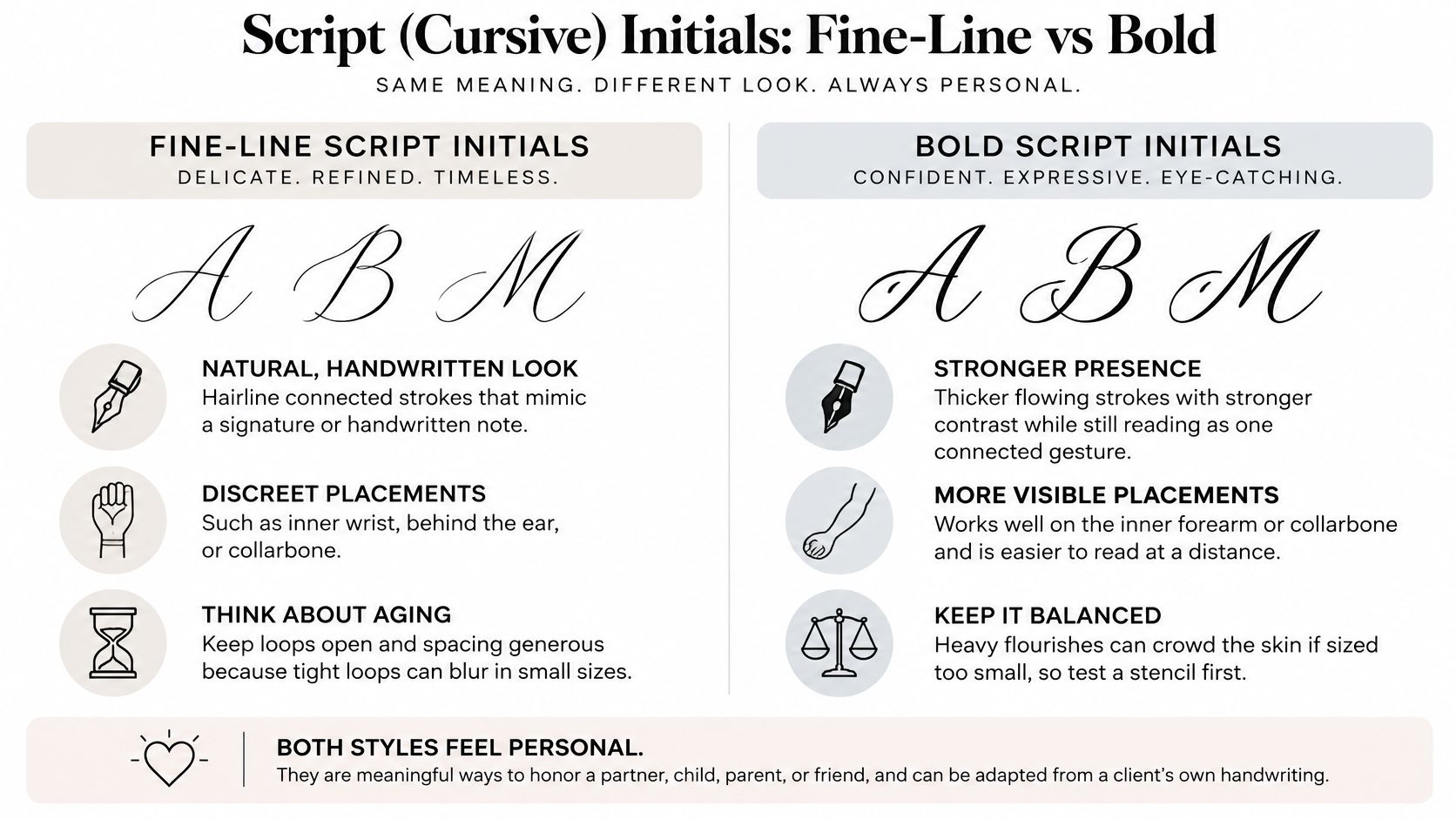
Test the Loops, Not Just the Outline
For a memorial initial on the inner forearm, bring the original handwriting sample and identify the stroke that matters most. Perhaps it's a long entry stroke or an unusual capital. Let the artist simplify less important marks.
You can compare Word's cursive font options to describe your preferences, but treat fonts as references rather than tattoo-ready drawings. Our script tattoo ideas offer more lettering directions to discuss.
Size test: Ask for the proposed stencil and an enlarged alternative. Compare the openings inside the letter without zooming in on a photograph.
Placement test: Turn your forearm naturally and check whether the flourish disappears around its side.
Detail trade-off: If you want a date alongside the initial, allow more space rather than shrinking everything.
A wrist can suit restrained script. Longer flourishes usually benefit from the extra room along the forearm.
2. Block Letter Initials
Block letters make the initial the focal point. They're a strong choice when you want someone to recognize the letter before noticing its decoration. A capital AM on the forearm, for example, can work with little more than balanced spacing and a restrained underline.
Bold doesn't mean filling every available gap with ink. The internal openings in an A, B, or R still need room, and thickening those letters without increasing their overall size can make them less readable.
This sketch shows how simple lettering can sit within a larger composition.
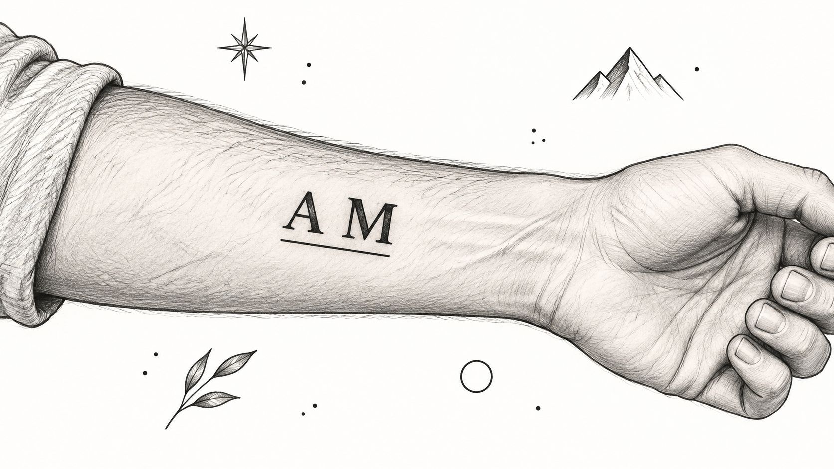
Balance the Letters on the Body
Equal spacing in a design file doesn't always look equal on an arm. An angled A beside a straight-sided M may need optical adjustment, especially when the outer edge wraps away from view.
For related examples, explore our block lettering tattoo guide. Use it to choose between solid capitals, outlined forms, and simpler architectural lettering.
Practical rule: Increase the overall letter size before increasing stroke weight inside an already cramped design.
Ask for a solid silhouette test: view the stencil from normal conversational distance, then check it with your arm relaxed. The initials should remain distinct without relying on tiny outlines or shading.
The outer upper arm provides room for a framed design. A narrower forearm placement may call for stacked letters or a shorter underline. Keep borders far enough from the letters that they don't become another competing stroke.
3. Blackletter (Gothic) Initials
Choose blackletter because you like its angular structure, not because it can squeeze elaborate lettering into a small space. Its dramatic points and dense strokes demand more room, particularly around the enclosed spaces artists call counters.
A blackletter R on the forearm can look strong and deliberate. Add a cross, star, border, and shading at the same scale, however, and the initial may become difficult to separate from its surroundings.
Decide How Quickly It Must Read
Some clients want unmistakable lettering. Others prefer an emblem that reveals the initial on closer inspection. Neither approach is wrong, but the artist needs to know which matters more before drawing.
For immediate recognition: Choose a simpler blackletter alphabet with fewer internal cuts and exaggerated spikes.
For a decorative emblem: Use a broader placement, such as the upper arm or calf, so ornament doesn't crowd the letter.
For future expansion: Leave space around the initial instead of boxing it into a tight border.
Ask for a counter-space test. Have the artist point out the smallest openings in the stencil and explain which details they'd simplify at your preferred size. If the letter only reads clearly when you lean close, compare a larger version.
View the stencil with the limb relaxed and rotated. A sharp vertical stroke can appear bent when it wraps across a pronounced curve.
A simple banner can balance blackletter's visual weight, but it also increases the space required. Don't solve a crowded letter by adding an equally crowded frame. Often, removing decoration produces the more convincing gothic tattoo.
4. Minimalist Fine-Line Initials
A subtle tattoo is still a permanent tattoo. Fine-line initials can feel discreet and personal, but their small footprint doesn't make them low-commitment or free from maintenance considerations.
A delicate J with a separate star on the inner wrist is a workable starting point. A tiny J tangled with a star, date, and heart asks the same patch of skin to preserve too many distinctions.
The FDA's tattoo safety guidance warns that contaminated inks can cause infections and that allergic reactions can appear years after tattooing. If you have concerns about skin sensitivity, previous reactions, or a medical condition, discuss them with a qualified clinician before proceeding.
Ask to See Healed Lines
Fresh photographs show sharp lines against recently tattooed skin. Healed examples are more useful for judging the result you'll wear. Look for consistent strokes and letters that remain readable without close-up photography.
Stencil test: Compare your preferred size with a slightly larger, simplified version at the same placement.
Location test: Keep wrist lettering clear of the main crease. For behind-the-ear placement, check visibility with your hair worn normally.
Maintenance discussion: Ask how the artist evaluates healed work and when a touch-up might be appropriate.
Fingers and palms are less forgiving choices for delicate lettering because reliable retention can be difficult. A touch-up also isn't permission to start with an unreadably small design.
If discretion matters, consider a covered upper-arm placement instead of forcing the letter into a tiny visible spot. You can keep the tattoo private without sacrificing the space it needs.
5. Ornamental Monogram Initials
Two capitals woven into one emblem ask the skin to hold more than either letter alone. Decide before the consultation whether the letters or the ornament leads. A family emblem across the upper back has room for scrollwork and overlapping capitals. The same knot compressed onto a wrist blurs into a tangle within a few years.
Monogram references from outside tattooing help you describe letter relationships. Embroidery work such as personalising bridal pyjamas with monograms shows how intertwined capitals or a formal central initial can sit together. Bring it to your artist as a description, not a stencil, because embroidery proportions aren't automatically suitable for tattooing.
Establish a Reading Order
Pick the primary letter first. Then decide where the secondary letter passes behind it and which decorative strokes could fade without changing the meaning.
A monogram can be intricate without making every stroke equally important.
For a couple's initials on the upper arm, ask the artist to keep the main letterforms readable before any border goes on. If the overlapping version needs explaining, compare it with initials that touch at a shared stroke instead.
Request a separated-letter test. Ask to see each letter alone, then combined at the intended tattoo size. You should be able to trace every main stroke through the finished stencil.
Judge the thinnest scrollwork as strictly as the bold capitals. Fine ornamental lines soften faster than heavy letterforms, so a design that reads crisply on day one can lose its lacework first. If preserving those details demands more space, take the space or cut the ornament.
For extensive scrollwork, plan the session with the larger composition in mind. A monogram placed centrally on the upper arm sets the anchor point for an eventual sleeve.
6. Floral-Framed Initials
A floral frame should support the initial, not hide it. Decide whether you're commissioning a letter with flowers or a botanical tattoo containing a letter. That choice determines which element gets the strongest contrast and the most space.
For a memorial piece, a loved one's favorite flower can be more personal than a generic symbolism chart. A rose wreath around an initial on the upper arm allows a different level of detail than a small botanical sprig beside an ankle letter.
The sketch below keeps the initial recognizable while using branches to soften its outline.
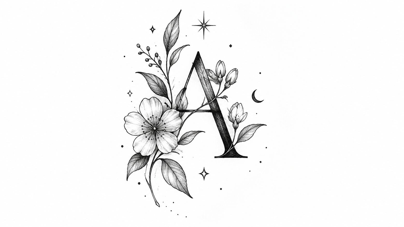
Protect the Letter's Edges
Leaves can resemble extra letter strokes. A stem crossing the wrong part of an A can obscure its crossbar, while dark petals beside a B can make its outline difficult to follow.
Hierarchy test: Ask to view the design without shading or color. The initial should still separate from the flowers.
Size test: Compare a fuller bloom with a simplified sprig at your preferred placement.
Contrast choice: Keep the darkest botanical shading away from the letter's most important openings.
Color introduces another planning decision. Choose it because you want color, not because a preview makes it look brighter than it will appear healed.
Ask for aftercare instructions and, once the tattoo has healed, protect it from prolonged sun exposure. For a smaller design, fewer petals and clear leaf shapes usually make more sense than compressed botanical detail. The strongest frame leaves visible breathing room around the initial.
7. Traditional Banner or Ribbon Initials
A banner gives an initial a clear home inside a larger tattoo. It can connect lettering to an anchor, flower, or other meaningful image without making the letter carry the entire composition.
The central panel needs enough uninterrupted space for the lettering. Decorative folds belong around that panel, not through the important parts of the initials. A wide ribbon on the calf can accommodate a different layout than a short banner across the forearm.
Fit the Ribbon Around the Letter
Start with readable lettering, then build the banner around it. Drawing an elaborate ribbon first and squeezing the initial into the remaining space reverses the useful order.
For example, an anchor with a red ribbon and a capital initial can make a coherent traditional design. Adding a date means enlarging the composition, reducing other detail, or moving the date elsewhere.
Design priority: The ribbon should frame the initial, not force it into a narrow fold.
Ask for a flat-panel stencil test. Check the lettering in the banner's central panel before evaluating shading, folded ends, or supporting imagery. If that panel isn't readable by itself, extra decoration won't fix it.
The forearm works when the central panel faces outward without excessive wrapping. The calf or upper arm offers more room for a taller composition.
Traditional-style outlines can provide strong separation, but they don't guarantee longevity regardless of size. Keep the gaps between letters, ribbon edges, and nearby imagery generous. A restrained palette can preserve the graphic character without making every surface compete for attention.
8. Geometric and Negative-Space Initials
With negative-space lettering, the uninked skin forms the letter. That reverses the usual design problem: instead of asking whether a fine stroke will remain visible, you're asking whether the opening around it will remain distinct.
A geometric M built from clear diagonals can suit an inner forearm. A narrow M carved out of a small dark shape has less margin for its internal spaces to soften.
This sketch shows a letter integrated with geometric and celestial details.
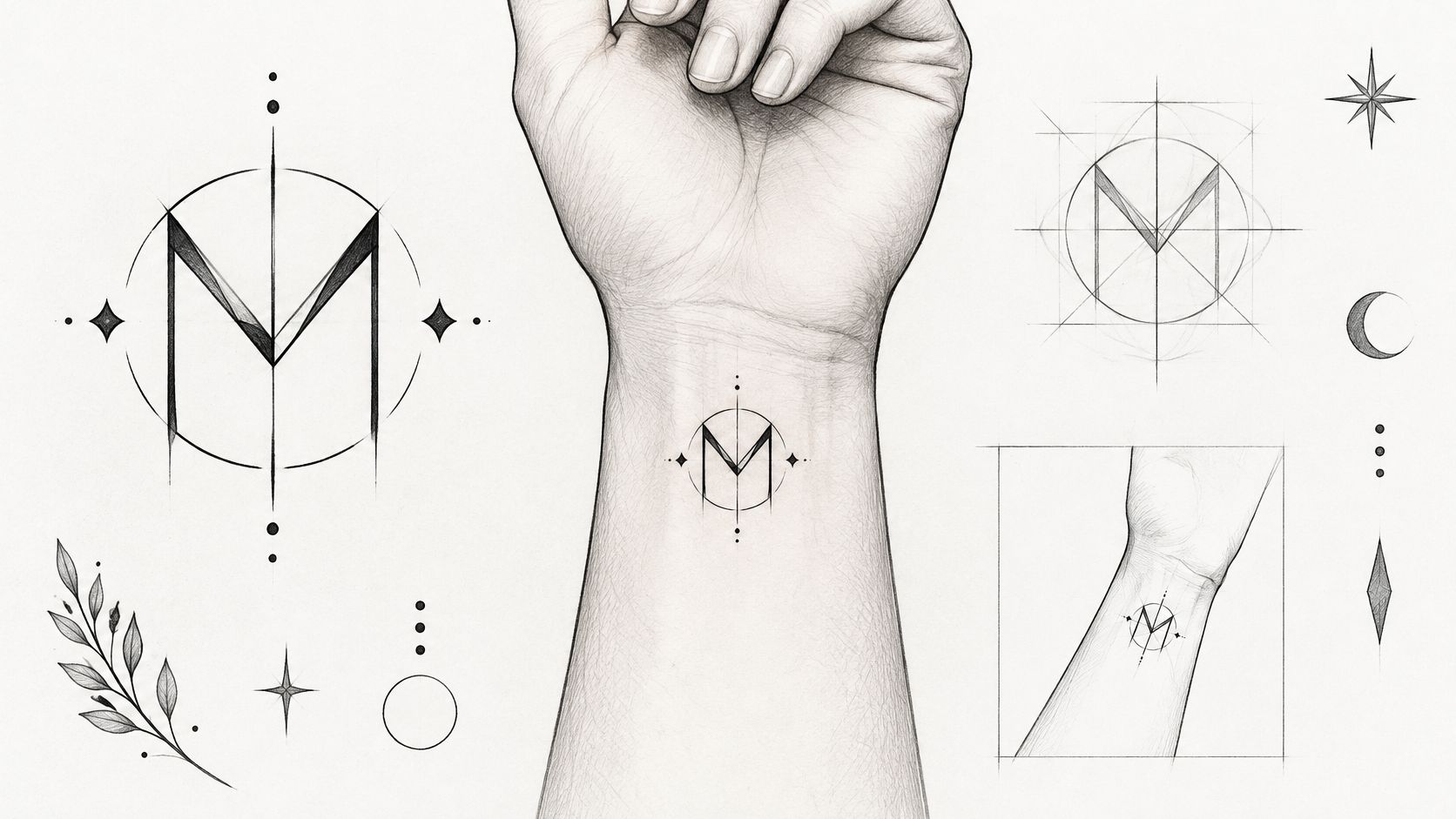
Test the Empty Space
Our negative-space tattoo design guide provides directions to discuss with your artist. For initials, prioritize open channels and recognizable silhouettes over tiny cutouts.
Fill test: Ask to see a filled mock-up, not just outlines. Negative-space letters depend on the balance between ink and bare skin.
Movement test: Check straight lines with your wrist relaxed and turned, or with your torso resting naturally for a sternum placement.
Simplification test: Remove decorative dots and celestial marks temporarily. The letter should still work without them.
Perfect symmetry on a screen won't look identical from every angle on a curved body. Choose the view that matters most and have the artist position the design accordingly.
Finger placement offers little room for generous negative space, so don't assume it's suitable because the concept looks minimalist. If the desired letter needs narrow skin channels to fit, enlarge it or move it. Simple geometry still needs sufficient scale.
Initial Tattoo Styles at a Glance
Item | Legibility | Typical Placement | Longevity | Best For |
|---|---|---|---|---|
Script (Cursive) Initials | Can be hard to read at a distance | Inner forearm, wrist, collarbone, behind the ear | Open loops and generous spacing help prevent blurring | Personal, handwritten-style designs |
Block Letter Initials | Excellent, even from a distance | Forearm, calf, upper back, chest | Bold lines tend to hold clarity well | Strong, modern, easy-to-read initials |
Blackletter (Gothic) Initials | Dense forms can be difficult to read at a glance | Forearm, upper arm, back | Dark strokes hold up well; tight details may fill in | Bold, dramatic, gothic designs |
Minimalist Fine-Line Initials | Very small letters may be hard to read | Wrist, fingers, ankle, behind the ear, collarbone | Fine lines may blur or fade, especially in high-friction areas | Discreet, delicate designs and first tattoos |
Ornamental Monogram Initials | Overlapping letters can reduce clarity | Chest, upper back, shoulder, forearm | Intricate details may blur or fill in over time | Elegant designs representing a couple or family |
Floral-Framed Initials | Depends on the size and detail of the lettering | Shoulder, thigh, calf, upper arm | Florals need adequate sizing; color may fade over time | Personal tributes and botanical designs |
Traditional Banner or Ribbon Initials | Easy to read when the banner is wide enough | Forearm, calf, chest, upper arm | Bold outlines tend to age well | Timeless, bold, flash-inspired designs |
Geometric and Negative-Space Initials | May be less recognizable as letters | Wrist, sternum, rib cage, forearm | Tiny negative spaces may close up or blur | Clean, modern designs with symmetry |
Turn Your Favorite Initial Into a Booked Appointment
Narrow your tattoo initial ideas to a small shortlist with a clear favorite. Bring references that explain your preferences, not a folder of unrelated designs. A handwriting sample, a preferred letter shape, and an example of the visual weight you like give the artist something practical to work with.
Write down what you're willing to change. You might be committed to the initial but flexible about the font, or committed to a discreet placement but open to simpler lettering. Knowing your priority makes the trade-offs easier.
Bring Decisions, Not a Finished Drawing
Your consultation notes should cover the details that affect the design:
Meaning: Whose initial is it, and which features make the reference personal?
Scale: Show the space you're willing to use on your body rather than describing it only as small.
Placement: Bring a preferred location and an alternative with more room.
Future work: Mention plans for a sleeve, surrounding florals, or additional initials.
Health concerns: Raise relevant skin concerns and seek medical advice when needed.
Think beyond the appointment, too. The FDA's tattoo and permanent makeup fact sheet notes that tattoo removal can be difficult and that patients should tell radiology staff about tattoos before an MRI because rare swelling or burning can occur. Don't treat removal as an easy fallback or avoid a medically necessary scan because you have a tattoo.
Ask to approve the stencil on your body before tattooing begins. Check it while standing naturally, confirm its orientation, and look at it from a normal viewing distance. Then confirm the aftercare instructions and how to contact the studio with healing concerns.
Our complimentary consultations cover design direction, placement, and timing. Booking requires a $100 non-refundable deposit, and you shouldn't send it until an artist or staff member directs you to do so. Call or text (720) 932-0124 to start discussing your initial.
The right appointment starts with a letter you care about and enough flexibility to make it work on skin.
At Think Tank Tattoo, we offer complimentary consultations to help turn your initial reference into a custom design with appropriate scale and placement. Bring your handwriting sample or favorite lettering references, and discuss which details to preserve, simplify, or enlarge before booking.
Comments