
7 Block Lettering Tattoo Ideas for Custom Designs
You've chosen words that matter, but the lettering decision suddenly feels just as important. The same name, date, or personal phrase can look traditional, dimensional, rebellious, understated, illustrative, or geometric depending on how the artist builds each character. A successful block lettering tattoo isn't only about selecting a typeface. It's about balancing visual weight, scale, spacing, body curvature, and the artist's experience with line work and shading.
The seven directions below will help you compare distinct approaches, from classic serif structures to custom blackletter compositions and sacred geometry. You'll also find practical questions to bring to a Think Tank Tattoo consultation, where references, placement preferences, and a realistic sense of size can turn an idea into an artist-ready brief. If you've ever compared type choices for visual branding, the same principle applies to pairing fonts for photo watermark. The construction changes how people read the message.
Table of Contents
1. Classic Bold Block Letters with Serif Elements - Make readability part of the design
2. 3D Shadow Block Letters with Depth Effects - Choose a surface that supports the illusion
3. Graffiti-Style Block Letters with Tags and Wildstyle Elements - Protect the word inside the movement
4. Old English and Gothic Block Lettering - Treat cultural reference with care
5. Minimalist Single-Line Block Letters - Minimal doesn't mean maintenance-free
6. Blackletter Block Letters with Integrated Imagery - Build the concept before choosing the font
7. Geometric and Symmetrical Block Letters with Sacred Geometry - Precision starts with placement
1. Classic Bold Block Letters with Serif Elements
Classic bold block lettering gives a meaningful word a firm visual presence without relying on elaborate decoration. Thick, geometric characters create immediate readability, while small serif details add a traditional edge. The result can recall vintage signage, institutional lettering, or carefully drawn initials rather than a default computer font.
This direction works well for a name, a short mantra, initials, or a phrase you want people to read easily. A forearm name piece can feel direct and confident, while the same structure across the chest or shoulder can become more formal and prominent. The artist may adjust the letter width, corners, and serif shape so the design follows the body instead of looking pasted onto it.
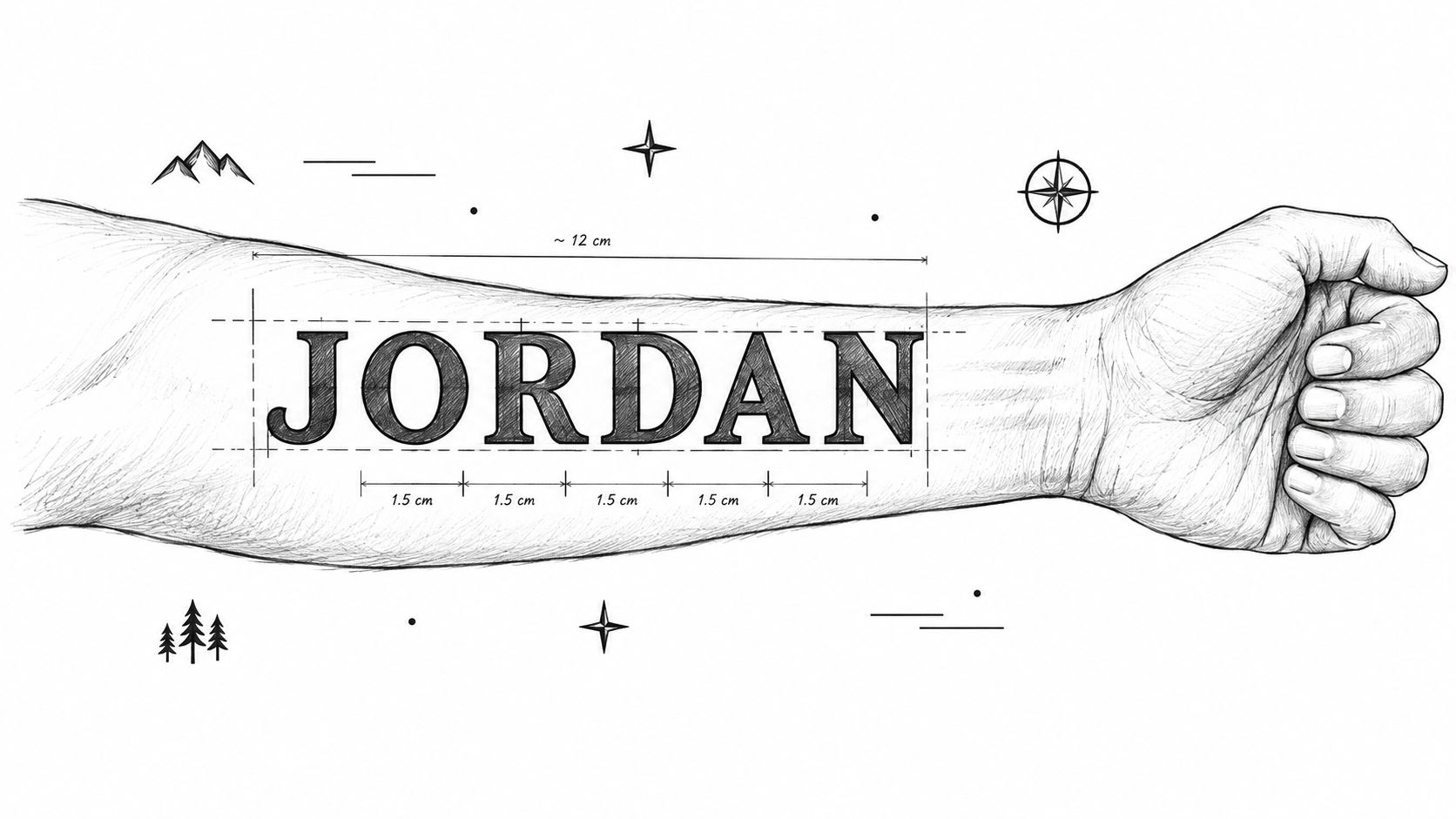
Make readability part of the design
Block lettering is often considered one of the most legible and forgiving text styles over time, but spacing remains critical. Tattoo lettering guidance warns that cramped letters can merge visually, while stretching or compressing text across moving body areas can reduce readability.
Ask your artist:
Letter spacing: How much open space should remain between characters at the chosen size?
Body curvature: Will the text need optical adjustments on a shoulder, wrist, or rib area?
Future maintenance: Which edges or small serifs might need attention during a later touch-up?
Larger lettering often gives the structure more room to breathe and helps preserve crisp forms. Bring reference images, but treat them as starting points rather than a final stencil. A skilled artist can retain the feel you like while redrawing the letters for your anatomy.
Practical rule: Judge the design at its actual intended size, not only enlarged on a phone screen.
2. 3D Shadow Block Letters with Depth Effects
A flat word becomes more dramatic when the artist builds a believable light direction behind it. Three-dimensional block letters can appear raised above the skin, recessed into it, or layered like constructed signage. Darker shadow shapes, selective highlights, and consistent perspective create the illusion.
“RISE” on a forearm, for example, could use a drop shadow that falls in one direction across every letter. A larger chest or back composition might make a name look carved, stacked, or mounted above an illustrated background. The effect depends less on adding random darkness and more on keeping the shadow angle consistent from character to character.
Choose a surface that supports the illusion
Flat or comparatively broad areas, such as the chest, back, or forearm, give the artist more control over perspective. A highly curved or constantly flexing placement can distort the relationship between the letter face and its shadow. The artist should also show you healed examples of their shading and depth work, not only fresh tattoos.
A grayscale treatment can make the value contrast especially clear, while restrained color may separate the face of the letter from its dimensional side. Your consultation should address:
Light direction: Where does the imagined light come from?
Shadow density: Will the depth read clearly without turning the word into a dark block?
Composition: Is the lettering standing alone, or does it need to interact with imagery?
Session planning: Can the artist give the shading enough time rather than rushing a complex effect?
For more reference on this specialized approach, review Think Tank Tattoo's 3-D tattoo artists and dimensional work. The strongest designs keep the illusion subordinate to readability. If the shadow competes with the letterforms, the tattoo may look impressive from close up but become difficult to read at a normal distance.
3. Graffiti-Style Block Letters with Tags and Wildstyle Elements
Graffiti-inspired lettering brings motion into a traditionally sturdy structure. The letters may interlock, lean, stretch, or connect with arrows, tags, outlines, and energetic flourishes. Unlike a plain block word, this approach can make the text feel like part of a visual identity.
A person might use their own tag, a neighborhood reference, a creative alias, or a word connected to music and street culture. A back piece can surround the lettering with larger imagery, while a full forearm or calf composition can let the characters travel along the limb. Color can amplify the mural-like quality, but grayscale can preserve a sharper tattoo contrast.
Protect the word inside the movement
Wildstyle complexity creates a practical risk. Every extra outline, extension, and overlapping shape takes visual space away from the core letters. Start with the word itself, then decide which embellishments strengthen its character and which ones merely fill space.
Bring street-art references that show the energy you want, but don't ask an artist to copy another person's tag or composition. Instead, explain what attracts you, such as angular connections, flowing outlines, exaggerated terminals, or a particular sense of motion. Your artist can build an original design around those qualities.
“The more intricate the lettering, the more carefully the artist has to protect the negative space.”
A larger placement usually gives graffiti elements room to remain distinct. Discuss whether the tattoo should read immediately or reveal details gradually as someone looks closer. Also ask how the design will wrap around the body, where the main word will sit, and whether future additions could crowd the composition.
4. Old English and Gothic Block Lettering
Old English and Gothic lettering carries a strong historical identity. Its dense characters, sharp forms, heavy vertical strokes, and ornate serifs can make a family name, heritage reference, or memorial phrase feel formal and enduring. Each letter often has enough personality to function as a small illustration.
The style draws from blackletter and related heavy, angular forms that originated in medieval Europe around the 12th century. Blackletter remained the dominant Western script for roughly 400 years before it fell out of everyday use in the early 20th century, a history summarized in this tattoo font guide covering Gothic and related styles. Later tattoo traditions connected text with names, mottos, and religious phrases, helping establish lettering as a durable form of personal marking.
Treat cultural reference with care
Old English isn't a neutral decorative filter. Its visual associations can vary depending on the wording, surrounding symbols, and the person wearing it. Discuss the intended meaning openly with your artist, especially if the design references family, ethnicity, religion, regional identity, or a specific cultural tradition.
A chest, upper back, upper arm, or full sleeve can support the density of the style. Small, tightly packed words can lose their internal openings, so ask the artist to test the phrase at true size. Think Tank Tattoo's calligraphy tattoo designs offer a useful starting point for comparing historical lettering structures with more flowing alternatives.
Black ink often suits the weight and contrast of Gothic forms. A consultation should cover the exact alphabet style, line weight, flourishes, spelling, and whether decorative elements are necessary. Don't choose a complicated reference because it looks striking on a screen. Choose a version that remains readable on your body.
5. Minimalist Single-Line Block Letters
Minimalist block letters reduce the design to essential geometry. A single continuous line, restrained outline, or very light stroke can create an understated word that feels modern and deliberate. The appeal comes from proportion and restraint rather than shadows, flourishes, or surrounding imagery.
This approach suits initials, a short name, a private reminder, or a single word placed on the wrist, ankle, collarbone, or forearm. It can also work well for matching tattoos when each person wants the same basic structure without a large, attention-grabbing composition. The simplicity makes every inconsistency visible, though, so the artist's control matters.
Minimal doesn't mean maintenance-free
Fine lines and small openings have less visual margin than heavy block forms. Practitioner guidance on tattoo lettering cites a block or serif letter height of about 10 pt equivalent, roughly 1/4 inch or 6 mm, as a minimum baseline for long-term readability. The same guidance recommends stronger sizing in the range of 1 to 1.5 cm for lettering intended to age more reliably, and suggests opening digital letter spacing by 5 to 15% for small text.
Those figures aren't a universal stencil rule. They're discussion points for your consultation. Skin, placement, line weight, and the exact font all change the result.
Ask a thin-line specialist to show healed work and explain how the lettering may change with time. Confirm whether the word still reads when viewed from a normal distance. A minimalist tattoo can be elegant, but reducing the design too far may turn a readable word into a delicate pattern.
6. Blackletter Block Letters with Integrated Imagery
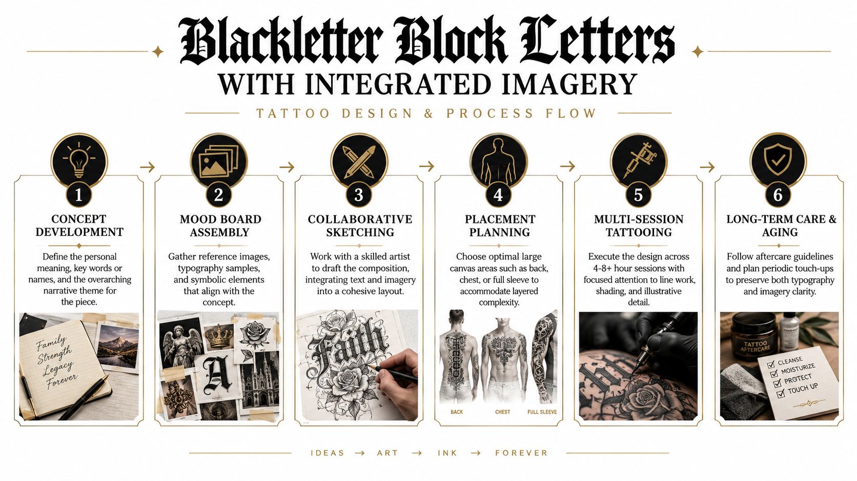
Integrated blackletter treats text as one component of a larger story. The letters may sit inside a scene, cross through ornamental framing, connect with flowers, or share space with portraits, symbols, or architectural forms. Instead of placing a word beside an image, the artist designs both elements as a single composition.
A memorial phrase might sit beneath a view that carries personal meaning. A sleeve could use blackletter as a structural anchor while imagery moves around the arm. A large thigh, chest, or full-back design gives the artist room to establish hierarchy, so the viewer knows which words to read first and which details to discover later.
Build the concept before choosing the font
This style benefits from a collaborative drawing process. Bring a mood board with the phrase, visual references, meaningful symbols, preferred blackletter characteristics, and examples of compositions you admire. Don't expect every reference to transfer directly. The artist needs to resolve scale, anatomy, negative space, and transitions between text and imagery.
The historical development of Chicano and black-and-gray tattoo culture also matters here. Sources describe lettering traditions developing in East Los Angeles and nearby prison and barrio communities during the 1940s and 1950s, then expanding through the 1960s and 1970s across parts of California, Texas, and New Mexico, as discussed in this lettering and calligraphy tattoo history guide. That lineage shows how bold, readable text can carry social identity, memory, and cultural expression, not just decoration.
Before committing, ask:
Narrative hierarchy: Which element should people notice first?
Future expansion: Could the composition accommodate later additions?
Session structure: How will the artist divide the work across appointments?
Symbolic clarity: Does each image have a reason to be present?
Large-scale work rewards patience and planning. The final design should feel personal even when its lettering draws from a recognizable tradition.
7. Geometric and Symmetrical Block Letters with Sacred Geometry
Geometric block lettering turns characters into part of a measured visual system. Circles, triangles, lines, grids, and symmetrical framing can shape the word itself or surround it with a mandala-like structure. The tattoo then operates in two ways. It communicates text, and it creates an abstract pattern.
Initials can sit at the center of a symmetrical chest piece. A name might align with a geometric frame across the shoulder blade or upper back. A forearm design can use repeated lines and controlled angles, but the artist must account for how the pattern changes when the arm rotates.
Precision starts with placement
Symmetry looks strongest when the artist has a stable reference point. Center chest, back, and the area between the shoulders can support balanced compositions, while curved placements may require subtle optical corrections. A geometric design that's mathematically even on paper can look uneven on the body if the anatomy isn't considered.
Discuss the framework before discussing decoration. Ask how the artist will keep letter proportions consistent, whether the text is centered mathematically or visually, and how much negative space should separate the word from its surrounding shapes. A larger design gives complex geometry more room to remain legible, while a small design may need fewer elements.
For background on combining precise pattern work with tattoo composition, explore Think Tank Tattoo's sacred geometry tattoo designs. You should also clarify whether the symbols have personal, spiritual, mathematical, or purely visual meaning. That answer can guide the artist's choices and prevent the design from becoming a collection of disconnected shapes.
7-Style Block Lettering Tattoo Comparison
Style | 🔄 Complexity | ⚡ Resources & time | ⭐ Expected outcome | 📊 Ideal use cases | 💡 Tip |
|---|---|---|---|---|---|
Classic Bold Block Letters with Serif Elements | Medium, precise line work; steady geometry | Moderate, single session typical; experienced liner recommended | ⭐⭐⭐⭐, very legible, timeless impact | Visible placements (forearm, chest, calf); names/phrases | 💡 Consult on placement; use larger letters and spacing for longevity |
3D Shadow Block Letters with Depth Effects | High, advanced shading, perspective accuracy required | High, multiple long sessions; specialist shading; higher cost | ⭐⭐⭐⭐⭐, striking, attention-grabbing dimensional effect | Large flat areas (chest, back, forearm); premium gallery-quality pieces | 💡 Use 2–3"+ letters; prefer grayscale for stronger 3D illusion; plan sessions |
Graffiti-Style Block Letters with Tags and Wildstyle Elements | High, complex composition and flow between letters | High, multi-session for large pieces; skilled graffiti-style artist | ⭐⭐⭐⭐, very unique and expressive, high visual energy | Backs, full sleeves, creative/urban clients, tag-style name pieces | 💡 Bring street-art refs; collaborate closely and favor larger canvases (4"+) |
Old English and Gothic Block Lettering | High, intricate, detail-intensive letterforms | High, long sessions; typographic expertise required; larger sizing | ⭐⭐⭐⭐, distinctive, heritage-rich and ornate | Family names, chest/back placements, heritage or tradition-focused designs | 💡 Keep words large (≥2–3"); black ink preferred; plan detailed consult |
Minimalist Single-Line Block Letters | Low, simple concept but requires steady hand for consistency | Low, short sessions; lower cost; thin-line specialist advised | ⭐⭐⭐, elegant and subtle but less durable (thin lines fade faster) | Small visible spots (wrist, ankle, collarbone); professional subtle pieces | 💡 Minimum 1–1.5" per word; expect touch-ups every 3–5 years |
Blackletter Block Letters with Integrated Imagery | Very high, combines detailed typography with illustrative elements | Very high, multi-session (6–12+ hrs), top-tier artist and planning | ⭐⭐⭐⭐⭐, gallery-quality, narrative-rich and highly collectible | Full backs, chest pieces, full sleeves for collectors and art-focused clients | 💡 Bring mood boards; plan long multi-session execution and detailed briefs |
Geometric and Symmetrical Block Letters with Sacred Geometry | High, precision, symmetry, and mathematical layout required | High, extended consultation and precise line work; skilled designer-artist | ⭐⭐⭐⭐, visually harmonious and conceptually layered | Centered placements (chest, back, between shoulders); spiritual/design enthusiasts | 💡 Schedule extended consult; use 3"+ sizing for geometric clarity and symmetry |
Turn Inspiration Into an Artist-Ready Concept
Start by confirming the words. Check spelling, capitalization, dates, initials, accents, and the exact order of every character before the artist prepares the final design. A tattoo can be visually excellent and still fail its purpose if the wording is incorrect or the phrase no longer reflects what you intended.
Next, narrow the visual direction. Choose whether you're drawn to classic serif weight, dimensional shadow, graffiti motion, Gothic density, minimalist restraint, integrated storytelling, or geometric structure. You don't need to arrive with a finished font. Bring references and explain what you like in each one, such as the width of the letters, the shape of the serifs, the amount of open space, or the way the text interacts with imagery.
Placement and scale should be discussed together. A word that looks balanced on a flat screen may need redesigned spacing on a wrist, shoulder, rib, or calf. Body curvature, movement, and skin surface all affect how the letters appear. Experienced lettering guidance also emphasizes allowing breathing room and testing whether the design remains readable at its true intended size, not only in an enlarged digital preview.
Your consultation questions can stay focused:
Readability: Will the phrase remain clear from an ordinary viewing distance?
Line weight: Are the strokes appropriate for the selected size and placement?
Spacing: Could healing and natural visual spread cause letters to merge?
Dimensionality: Does shading improve the word, or does it compete with it?
Aging: What changes might appear over time, and how could touch-ups be handled?
Process: How many appointments might the design require, and how will the artist pace the work?
Current 2026 trend coverage describes growing interest in handwriting-based lettering, short meaningful words, dates, coordinates, bold blackletter, and high-contrast blackwork, as reported by this overview of projected tattoo styles for 2026. That direction toward personalization doesn't make classic block lettering outdated. It creates a useful choice. You can select a clean traditional structure for dependable readability, or ask an artist to customize the letterforms so the design carries more of your identity.
Denver readers can use Think Tank Tattoo's complimentary consultation to discuss wording, design direction, placement, and timing. The studio was established in 2002 and offers a collaborative environment for custom work, with artists working across varied styles. If you're researching tattoo options beyond your local area, a resource such as find ink in Anderson SC IN CA may also help you compare studios and plan your search.
Bring your phrase, references, preferred placement, approximate scale, and an honest answer to one central question: do you want the words to be read first, or do you want the tattoo to function primarily as a complex piece of visual art? That answer gives your artist a practical starting point without limiting the creative process.
Think Tank Tattoo offers complimentary consultations for custom lettering, including conversations about wording, placement, scale, and the visual direction that suits your idea. Visit Think Tank Tattoo to share your block lettering concept with the Denver studio and schedule a consultation.
Comments