
8 Matching Tattoo Designs to Make Your Own
Two people sit down to plan matching tattoos and usually hit the same wall fast. You want something connected, but you don't want the obvious design that feels copied from a mood board or forced into identical placements that don't suit either body.
The strongest matching tattoo designs don't need to be exact duplicates. They work on their own, they still make sense years later, and they respect how each person wants to wear a tattoo. That's especially important when one person wants visible ink on the wrist and the other wants something quieter on the rib, ankle, or inner arm.
Matching tattoos also aren't a fringe idea. Tattoo history stretches back more than 5,000 years, and coordinated marks have long been used to show belonging, loyalty, or shared identity across cultures. In modern survey data, YouGov found that 7% of adults surveyed said they'd gotten a matching tattoo with someone else, which gives the idea a very real place in mainstream tattoo culture.
The smart way to choose is to start with the connection, then build the design around it. The eight ideas below move from light coordination to fully custom artwork, with practical guidance on placement, scale, line or color style, alignment, consultation, booking, and aftercare. If you're in Denver, Think Tank Tattoo offers complimentary consultations to help refine direction, placement, and timing before anyone commits to the stencil.
Table of Contents
2. Matching Line Work and Minimalist Designs - The trade-off with fine lines
3. Coordinates and Location-Based Designs - Make the text readable first
5. Matching Date and Numeral Designs - Choose the numeral style for readability first - Match the visibility to the meaning - Plan the session like a precision job
8. Matching Personal Art or Custom Illustration Designs - Why custom work holds up better - Placement, sizing, and planning details
1. Complementary Symbol Pairs
Complementary symbols are one of the safest and most flexible ways to approach matching tattoo designs. Each person gets a related image, but neither tattoo feels incomplete alone. That's why pairs like sun and moon, key and lock, wave and mountain, or compass and star stay popular. They express connection without requiring perfect duplication.
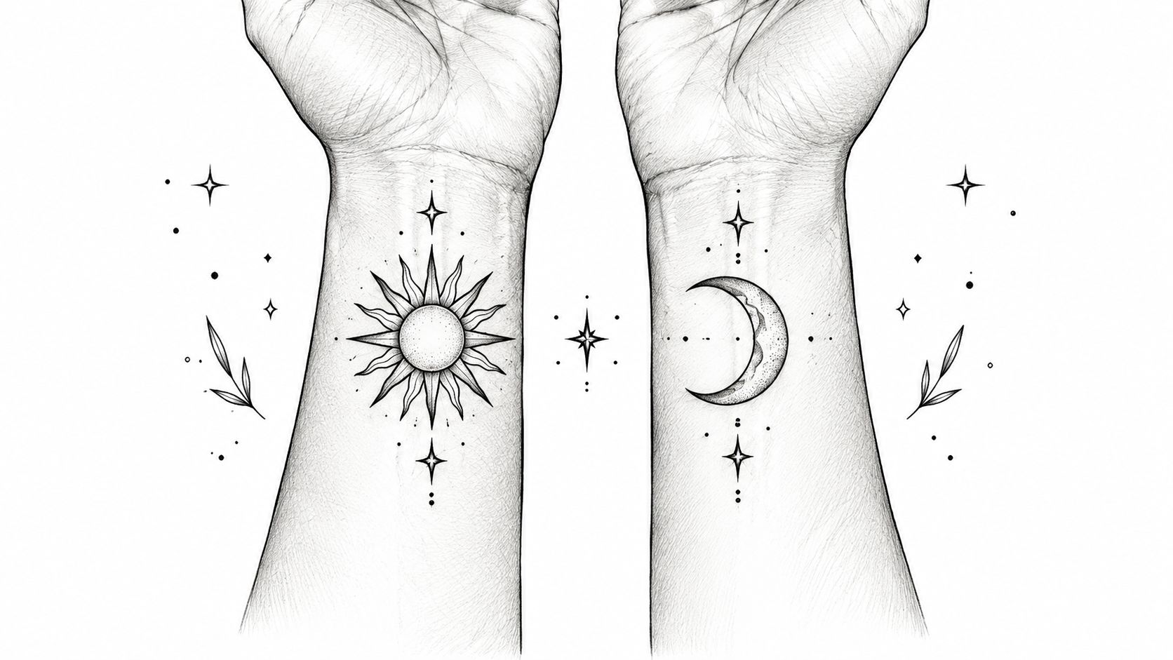
This format works well when two people have different styles. One person might want a crisp geometric sun on the outer forearm, while the other prefers a softer moon behind the ear. The connection still reads because the idea is shared, even if the execution shifts.
Where these work best
Wrists give you daily visibility, but they're also always on display. Inner forearms are easier to size well and usually give the design more room to breathe. Behind-the-ear placements can look elegant for small celestial symbols, but they need simple shapes and confident line weight.
A good rule is to make sure each symbol carries equal visual weight. If the sun is detailed and bold while the moon is tiny and sparse, one tattoo can feel like the "main" piece and the other like the leftover.
Practical rule: Before you approve the final drawing, look at each tattoo separately in a mirror or photo. If one only makes sense when placed next to the other, simplify it.
A lot of clients also overlook color planning here. If you're considering soft gold tones, blue accents, or muted ornamental shading, review how those hues will relate in advance. For anyone comparing color references across artwork, product, or print materials, a general guide to PMS color matching by Dirt can help you think more clearly about consistency, even though tattoo pigment doesn't behave exactly like print color.
2. Matching Line Work and Minimalist Designs
Minimalist line work is often the answer when you want matching tattoo designs that feel personal but not loud. Fine-line botanicals, single-line animals, tiny constellations, abstract faces, and geometric marks can all read as connected without taking over a body part.
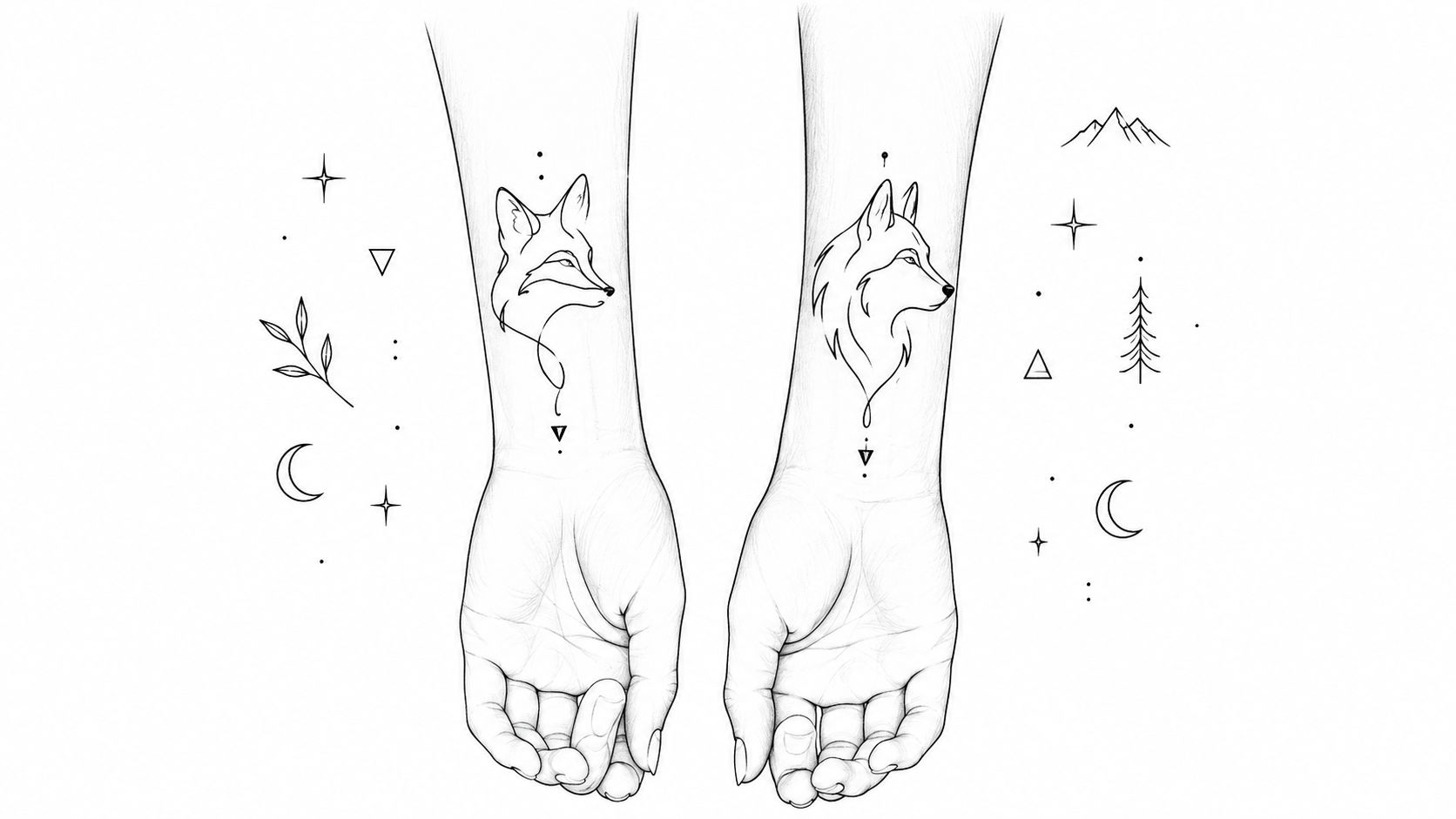
What works here is restraint. A simple branch on one person and a related leaf form on the other often ages better than ultra-tiny details packed into a thumbnail-sized space. If you like the clean look, it helps to review examples of simple line work tattoo ideas before narrowing your direction.
The trade-off with fine lines
Fine-line tattoos look effortless when they're fresh. The catch is that tiny details and very delicate spacing can soften with time, especially in high-friction spots. Independent guidance on matching tattoo planning also notes that finger, hand, and foot placements tend to fade fastest and need more touch-ups, which matters a lot when two people want their tattoos to age similarly over time in different placements.
That doesn't mean you should avoid minimalist work. It means you should size it appropriately.
Choose enough room: A tiny fox silhouette on the wrist can work. A fox with whiskers, stars, fur texture, and mountains compressed into the same space usually won't.
Match line weight, not just concept: If one piece uses whisper-thin lines and the other uses heavier outlines, they may stop feeling like a set.
Pick lower-wear placement when possible: Inner arm, upper arm, ribs, or shoulder generally preserve delicate work better than fingers or the side of the foot.
The best minimalist pairs are readable from a few feet away. If the design only looks good zoomed in on a phone screen, it probably needs revision.
3. Coordinates and Location-Based Designs
Coordinates are less about image and more about memory. They work well for siblings marking a hometown, couples remembering where they met, friends honoring a trip, or family members tying several places into one shared story.
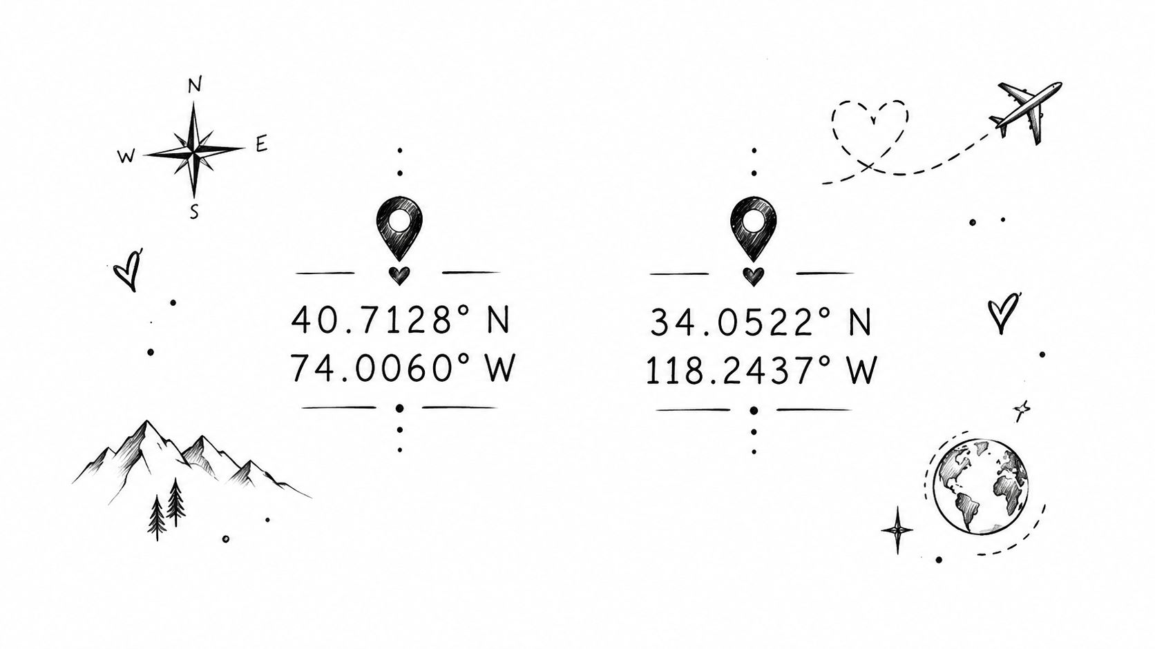
This category can look elegant, but it's unforgiving. If the numbers are wrong, the spacing is cramped, or the font is too fine, the tattoo loses its whole point. Text-based matching tattoo designs need just as much design discipline as illustrative work.
Make the text readable first
Coordinate tattoos usually land best on the forearm, upper arm, collarbone, rib, or along the side of the calf. Those areas give enough length for clear spacing. Tiny coordinate strings on fingers or the side of the hand often look sharp on day one and much less distinct later.
A lot of clients improve this idea by adding one small visual cue. Think a tiny star, dot, heart, or map line rather than a full scenic illustration. The text should stay the hero.
Bring the exact coordinate reference with you, then check it again before the stencil goes on. This is one of the easiest matching tattoo formats to get almost right, which is the same as wrong.
If the shared theme is travel, team trips, or a place-based event, visual references beyond tattoos can also help you coordinate the look and story around it. A practical example is this team outfit planning guide, which shows how people build a shared identity while still allowing individual variation. The same principle applies to tattoos. The common thread matters more than strict duplication.
4. Puzzle Piece and Interlocking Designs
Two people hold their wrists together for the photo, and the design clicks. A month later, one tattoo still looks strong on its own and the other only makes sense in that exact pose. That is the test with interlocking work.
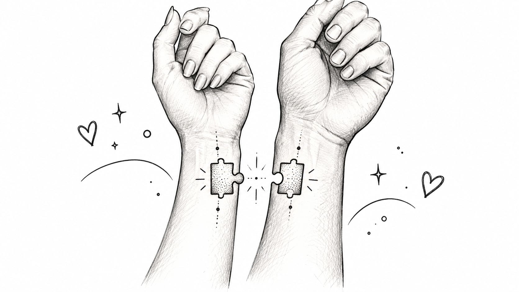
Puzzle pieces are the most familiar version, but the same connection can be expressed through two halves of a mandala, linked chain sections, a wave that continues across both bodies, or a design where one shape completes the negative space of the other. This category sits further toward "shared composition" than the earlier symbol or text ideas, so it asks for more planning.
Start with how the tattoos will read apart. If each piece looks unfinished alone, the concept is too dependent on a staged reveal. Good interlocking designs carry two jobs at once. They connect clearly together, and they still look intentional when each person is standing alone in normal life.
Placement decides whether that works.
Wrists, inner forearms, ankles, and collarbones are common because they can be brought together without much twisting. Fingers and the sides of hands are harder. The skin shifts more, fine edges blur faster, and the alignment only works from one angle. If clients want the "fit together" effect without fighting anatomy, I usually steer them toward forearms or just above the ankles.
Size matters here more than people expect. A tiny seam with lots of tabs, links, or nested detail can heal soft and lose the clean join. Simpler shapes age better. If the connection point is the whole idea, give it enough room to stay crisp.
A practical way to plan it:
stencil both tattoos in the same appointment
check them while standing naturally, not just in a posed photo
test the alignment with relaxed arms and with slight rotation
adjust each half for body differences instead of forcing mirror copies
keep the meeting edge clean and readable
That last point saves a lot of regret. The seam is where people tend to over-design. More linework does not make the connection stronger. It usually makes the join look busy.
Session planning also needs a little honesty. If one person sits better than the other, or one placement swells more, matching the final photos on day one may not happen. For larger split designs, booking both people back-to-back on the same day usually gives the artist the best control over scale, angle, and line weight. For very small interlocking tattoos, the work itself may be quick, but the stencil stage often takes longer than clients expect.
Healing can change the read, too. If one person picks at a fine border or gets more friction from watches, socks, or sleeves, the two tattoos may age differently even if they started nearly identical. Keep the aftercare simple. Wash gently, avoid rubbing the area, and do not judge the alignment while the skin is swollen.
For a quick visual reference on paired placement and alignment, this clip gives a useful example of how connected tattoos are presented in motion:
5. Matching Date and Numeral Designs
Two people can agree on the same date and still need very different tattoos. One may want a private memorial on the rib or inner arm. The other may want a cleaner, more visible piece on the forearm or ankle. That difference is normal, and date tattoos usually work better when the connection stays consistent while the layout respects each person's body and comfort level.
Dates and numerals carry shared meaning in a direct way. Anniversary dates, birth years, memorial numbers, and milestone sequences all fit this category. The design challenge is making the numbers feel intentional at tattoo size, not like text copied from a screen.
Choose the numeral style for readability first
Roman numerals create distance and formality. Standard numerals read faster and usually hold up better at smaller sizes. Script softens the look, but it also needs more room and a steadier placement if you want the characters to stay clear as the tattoo ages.
Small details matter here. A date that looks balanced on paper can tighten up quickly on curved skin, especially on wrists, collarbones, hands, or ankles.
Studio note: Check the date format character by character before the stencil goes on. Month-day-year, day-month-year, and Roman numeral conversions are common places for avoidable mistakes.
Match the visibility to the meaning
A wedding date on the inner bicep feels private. The same date on the wrist or forearm reads more publicly. Larger numerals usually sit better on flatter areas like the outer forearm, upper arm, calf, or upper back. If both people want the same date but different placements, keep one shared rule in place, such as identical formatting, line weight, or separator marks.
That approach keeps the tattoos connected without forcing a copy-and-paste result.
A support element can help when the date alone feels too bare. Fine-line dividers, a small star, a branch, or a simple frame can give the tattoo structure. Keep those additions restrained. With numeral tattoos, extra decoration tends to crowd the date faster than clients expect.
Plan the session like a precision job
Date tattoos are often small, but they still benefit from a proper stencil review and a pre-booked appointment. Matching pieces go more smoothly when both people can confirm spacing, orientation, and exact character order before anyone sits down. If one tattoo is in Roman numerals and the other is in standard numbers, compare both at final size first. The concept may match while the visual weight does not.
Pro tip: ask the artist to print the date at true size more than once. A version that looks sharp at 3 inches may lose clarity at 1.5.
Healing is usually straightforward, but placement affects the outcome. Fingers, wrists, feet, and areas with regular friction can soften fine numerals faster than upper arm or calf placements. Keep the area clean, avoid rubbing from watches or tight clothing, and do not judge crispness while the skin is still dry or lightly scabbed. Small date tattoos often look settled only after that early healing phase passes.
6. Matching Quote or Lyric Designs
One person wants the opening words. The other wants the line that answers it. That setup can work well, but only if each tattoo reads cleanly on its own and still feels connected as a pair.
Text-based matching tattoos carry more pressure than symbol work because every spacing choice, line break, and font decision stays visible. A strong quote or lyric usually gets pared down before it gets tattooed. If the phrase needs a full explanation to matter, it often belongs in a journal, not in skin.
Start with the phrase before you start with the font. Read it at normal speaking pace. Then split it where the meaning still holds. A weak break leaves one person with half a thought, which is the fastest way to make a matching text tattoo feel uneven.
Lettering style decides how small you can go. Script can feel personal, but tight loops and thin upstrokes fade into each other faster than clients expect, especially on narrow placements. Clean serif or sans serif lettering usually holds better at smaller sizes. If you want a softer, handwritten look, reviewing different calligraphy tattoo designs helps narrow down what will still read well after healing.
A few pairings tend to work in practice:
Split quote across both inner forearms when readability matters first.
Shared lyric on rib, upper arm, or collarbone when you want a more private placement.
Same phrase in two different handwriting styles when the connection matters more than visual symmetry.
One key word each, plus a small shared symbol, when the full line feels too long.
Placement changes the whole result. Forearms give text room and make stencil review easier. Collarbone and rib placements can look elegant, but movement and curvature affect spacing, so the line often needs to be shorter than planned. Wrists can work for a brief phrase, though fine lettering there may soften sooner from sun, motion, and daily wear.
Pro tip: print the quote at final size and tape it to the body part for a day. If you have to squint, rotate your arm, or shorten the wording to make it fit, do that before the appointment.
Session planning matters here because text leaves little room for correction. Confirm capitalization, punctuation, apostrophes, and line breaks together before the stencil goes on. For lyrics, verify the exact version you want. People remember songs incorrectly all the time, and artists should not be asked to guess.
Healing is usually straightforward, but aftercare affects readability more with text than with many small symbols. Keep the area clean, avoid friction from sleeves or waistbands, and do not pick at flaking skin. A quote tattoo often looks slightly cloudy during early healing, then sharpens as the surface settles. Patience helps. So does choosing a placement that gives the letters enough space from the start.
7. Matching Animal or Spirit Animal Designs
Two people can both want an animal tattoo and still need very different solutions. One may want a clean, symbolic mark that reads from a distance. The other may want anatomy, texture, and movement. Matching works best here when the connection is clear but the execution fits each person.
Animals express connection in a few distinct ways. Some pairs are natural complements, like wolf and raven, lion and lioness, or sun moth and moon moth. Some work as the same species in different poses, such as two swallows banking in opposite directions. Others share one visual language, like blackwork snakes or fine line foxes, even if the compositions are different.
Start by deciding what is being matched. Meaning, species, style, or composition.
That choice affects placement more than many people expect. A perched owl can sit neatly on a forearm or calf because the body gives it vertical space. A coiled snake can wrap an ankle or wrist, but those spots need simpler line decisions or the shape turns muddy during healing. If the design depends on eyes, feathers, scales, or fur texture, size has to increase with it.
If you're still choosing between species or visual approaches, it helps to review a range of tattoo designs of animals before the stencil stage. People often arrive set on one animal, then switch once they see which shapes suit the body part they want.
A practical way to plan these is to treat each pair as one project, even if the tattoos will not be identical. Bring reference for both tattoos at the same time. Confirm whether you want mirrored movement, shared ornament, matching black fill, or different levels of detail. That prevents a common mismatch where one design looks finished and the other looks like a simplified afterthought.
Session planning matters more with animals than with text or symbols because small anatomy errors stand out fast. Paw size, eye placement, wing length, and head angle all affect readability. If one person is booking ribs or sternum and the other is booking outer arm or calf, allow enough time for stencil adjustment. The same drawing rarely transfers cleanly to both bodies without changes.
Healing also changes how animal tattoos read. Fine whiskers, thin feathers, and tiny negative-space breaks can soften early, especially on high-motion areas. Keep the area clean, avoid friction, and do not judge the tattoo while it is cloudy or flaky. If the goal is long-term clarity, simplify before the appointment rather than asking the artist to pack too much detail into a small footprint.
8. Matching Personal Art or Custom Illustration Designs
Two people walk in with the same memory and completely different tastes. One wants a quiet blackwork piece on the inner forearm. The other wants a softer illustration on the shoulder. Custom matching work solves that problem better than any preset symbol because the connection stays shared while the execution fits each person.
This category works well when you want the bond to show through original artwork rather than a repeated icon or short phrase. The shared link might be a family object, a place only the two of you know, a childhood drawing, a handwritten note, or one scene split into two separate compositions. That usually produces stronger matching tattoos because the design is built around meaning, placement, and long-term readability at the same time.
Why custom work holds up better
Custom illustration gives the artist more room to solve practical tattoo problems before the stencil goes on. One design may need heavier black to stay clear at a small size. The other may need more open skin because of placement, skin tone, or nearby tattoos. If one person wants a vertical piece on the calf and the other wants a wider design across the collarbone, the artwork should be redrawn, not forced into the same proportions.
A collaborative process also improves satisfaction. In a mixed-methods medical tattooing study, 21 of 25 respondents were satisfied with results, 24 of 25 would recommend the service, and many valued practitioners who explained the process and chose color and shape together. Decorative tattooing is a different context, but the takeaway still applies. People usually feel more settled with permanent work when they understand the design choices and help shape them.
Pro tip: Keep one shared anchor and one personal variable. Use the same base illustration, then change framing, scale, texture, color accents, or a small object inside the design so both tattoos relate without feeling copied.
Placement, sizing, and planning details
Custom matching pieces need more prep than dates, quotes, or small symbols. Bring all reference material to the consult at the same time, even rough sketches or phone photos. That helps the artist decide what should stay identical, what should change, and whether both tattoos need to be done in one session or split across two appointments.
Size matters more than people expect. Fine illustrated details, tiny facial features, handwritten texture, and layered background elements can blur if the design is pushed too small. If the goal is a custom piece that still reads cleanly years from now, simplify secondary details early instead of shrinking the whole drawing to fit a small area.
Healing should also shape the plan. Custom work often includes delicate line variation or light shading, and those details can look patchy during the first couple of weeks. Choose placements with manageable friction if possible, follow standard aftercare closely, and expect the tattoo to soften slightly as it settles. A good custom matching design still looks connected after healing, even if the two pieces are not identical on day one.
8-Point Comparison of Matching Tattoo Designs
Design | Complexity 🔄 | Resource needs ⚡ | Expected outcomes ⭐📊 | Ideal use cases 💡 | Key advantages ⭐ |
|---|---|---|---|---|---|
Complementary Symbol Pairs | Low–Medium 🔄🔄 | Low ⚡ | ⭐⭐ 📊 Subtle, meaningful connection | Couples, friends, siblings | Timeless, flexible sizing, easy to customize |
Matching Line Work & Minimalist Designs | High 🔄🔄🔄 | Medium ⚡⚡ | ⭐⭐⭐ 📊 Sophisticated, ages well if executed properly | Style-conscious clients; first-timers | Fashionable, low shading, integrates into larger pieces |
Coordinates & Location-Based Designs | Low–Medium 🔄🔄 | Low ⚡ | ⭐⭐⭐ 📊 Deeply personal, discreet and unique | Long-distance couples, travelers, families | Highly personal, compact, lasting significance |
Puzzle Piece & Interlocking Designs | Medium–High 🔄🔄🔄 | Medium–High ⚡⚡ | ⭐⭐⭐ 📊 Strong visual impact when combined | Committed couples, close friend groups | Memorable, symbolic of completion, photo-worthy |
Matching Date & Numeral Designs | Low 🔄 | Low ⚡ | ⭐⭐ 📊 Timeless commemoration, discreet | Couples marking anniversaries; family milestones | Compact, classic, combinable with other elements |
Matching Quote or Lyric Designs | Low–Medium 🔄🔄 | Low ⚡ | ⭐⭐⭐ 📊 Deeply personal and conversational | Couples/friends sharing books, songs, films | Highly personalized, expressive typography options |
Matching Animal / Spirit Animal Designs | Medium–High 🔄🔄🔄 | Medium–High ⚡⚡ | ⭐⭐⭐ 📊 Visually striking and symbolic | Nature lovers; symbolic couples; bold statements | Strong symbolism, creative style flexibility |
Matching Personal Art / Custom Illustration Designs | High 🔄🔄🔄 | High ⚡⚡⚡ | ⭐⭐⭐ 📊 Unique, bespoke results with high emotional value | Clients wanting one-of-a-kind, meaningful pieces | Fully custom, professional execution, maximum personalization |
Turn a Shared Idea Into Wearable Art
The right matching tattoo design depends on how you want the connection to read. If you want something subtle, complementary symbols or minimalist line work usually give the most flexibility. If precision matters more than imagery, dates, quotes, or coordinates can be a clean fit, as long as you size them for long-term legibility. If the relationship itself is the visual concept, interlocking pieces or paired animals can make that connection more visible without forcing identical tattoos.
The most useful question isn't "what matching tattoo should we get?" It's "what should still feel right when each person is standing alone?" That's where good decisions happen. A tattoo can honor a partnership, friendship, sibling bond, or shared history without making either person wear a design that only works in a posed side-by-side photo.
If you're narrowing options, keep the process practical. Agree on the meaning first. Then choose the style that suits both people, whether that's fine line, lettering, illustrative blackwork, or something fully custom. Test the placement with the body in mind, not just the sketch. Confirm spelling, dates, or coordinates carefully. Decide whether each tattoo should stand alone or connect more directly. Then ask the artist how line weight, scale, and aftercare will affect the way the piece settles over time.
That planning matters because matching tattoos involve more coordination than most first-time clients expect. You're not only approving a drawing. You're balancing two bodies, two preferences, two healing routines, and often two different visibility comfort levels. Taking more time up front usually leads to a stronger result than chasing the fastest appointment.
For Denver readers, Think Tank Tattoo is one local option for that planning stage. The studio offers complimentary consultations to talk through design direction, placement, and timing. Booking is available by phone or email, requires a non-refundable $100 deposit to reserve an appointment, has a $100 shop minimum, and is available to clients 18 and older. Think Tank Tattoo has been refining custom work since 2002, which is especially relevant when a matching idea needs to be adjusted into two tattoos that still feel balanced and personal.
Whatever concept you choose, don't rush the final approval just because you're excited. Follow the artist's aftercare instructions closely, especially if both tattoos need to heal with similar clarity. And only schedule the session once both people are comfortable with the final design, placement, and scale.
Think Tank Tattoo offers complimentary consultations that can help you sort out the decisions behind matching tattoo designs, including style direction, placement, and whether the tattoos should mirror, complement, or stand alone. If you're ready to turn a shared idea into something wearable and well-planned, visit Think Tank Tattoo to start the conversation.
Comments