
8 Name Sleeve Tattoo Ideas for 2026: Styles and Placement
You're probably in the same spot I see all the time. You've got three names, maybe a date, maybe a screenshot of a font, and a rough idea that it should become a sleeve. Then the practical questions hit. How big does the lettering need to be on a forearm? What still reads clearly after healing? What happens if you want to add another family member later, or if one part of the design matters less to you in a few years?
That's where clients often get stuck with name sleeve tattoo ideas. The names aren't the hard part. The hard part is choosing a style that stays readable, heals cleanly, and fits the arm in a way that still makes sense over time. Tattoo history backs up why names matter so much in the first place. Tattooing likely goes back more than 10,000 years, and historical records show tattoos used for group identity, military experience, difficult life events, significant dates, and remembrance of loved ones, which makes names one of the oldest personal tattoo themes you can choose, not just a modern trend, as outlined in Penn State's history overview of tattooing.
Below are eight name sleeve styles, sorted by what each one does best. For each, I'm looking at the same things I'd cover in a real consultation: readability, healing, placement, and long-term flexibility. If you're booking in Denver, this is also the mindset I'd bring to planning sessions, sizing decisions, and reference prep before you sit down with Think Tank Tattoo.
Table of Contents
1. Traditional Ribbon Banner Name Sleeve - What it does well over time - Consultation prompt
2. Fine-Line Script Name Sleeve - Where fine-line script succeeds and fails - Personalization prompt
3. Birth Flower Name Sleeve - Why it's strong for multi-name sleeves - Personalization prompt
7. Family Tree Roots Name Sleeve - Planning for present names and future additions - Personalization prompt
8. Memorial Portrait and Name Sleeve - Photo quality and composition matter more than people expect - Personalization prompt
1. Traditional Ribbon Banner Name Sleeve
If you want a name sleeve that reads fast, even from across the room, traditional ribbon banners are hard to beat. They've been part of classic tattoo vocabulary for a long time, and they solve a practical problem better than a lot of more modern styles do. Each name gets its own container. That matters because sleeves fail when every element competes for attention.
A banner also gives the artist a built-in edge around the lettering. That border helps the eye separate the name from roses, daggers, swallows, anchors, or whatever else frames it. On a forearm, stacked banners can wrap nicely without turning into a blur. On an upper arm, a single large banner can sit over the bicep with a name and date that still feels bold after healing.
What it does well over time
This style works best when you keep it disciplined. Three or four names usually read better than trying to jam in a full family roll call. The more banners you add, the more important spacing becomes around the elbow ditch, inner arm, and wrist taper.
Practical rule: If the banner shape looks good but the lettering feels cramped on the stencil, the problem isn't the stencil. The design is too small.
Use a simple, bold letterform. Skip delicate flourishes. Traditional sleeves age best when outlines stay confident and the text doesn't depend on tiny internal details.
Best placement: Outer forearm, upper arm, and panels that wrap slightly rather than fully spiral.
Healing consideration: Bold linework is forgiving, but folds near the elbow can still distort a ribbon if the placement ignores how the arm bends.
What doesn't work: Too many names, too much scroll movement, or thin script inside a heavy banner.
A common real-world version is a central rose on the forearm with two family names above and below it on curved ribbons. Another is a single memorial banner on the upper arm with a date tucked beneath it.
Consultation prompt
Bring the exact names in final spelling, plus any dates you want under them. Then answer one question clearly. Should each name have equal weight, or is one name the focal point and the others supporting elements? That answer changes the whole sleeve.
2. Fine-Line Script Name Sleeve
A fine-line script sleeve looks soft on paper and subtle on skin. It's usually the first thing people picture for a partner's name, a child's name, or a memorial piece based on handwriting. It can be beautiful. It can also be the easiest style to under-size.
Research on tattoo pigment persistence matters here. Tattoo ink sits in the dermis, and research summaries note that particles can gradually migrate within that layer, which contributes to fading and blurred edges over time. That's why ultra-fine script, crowded flourishes, and tiny counters inside letters can become hard to read as the tattoo ages, especially in high-motion areas, according to the ANR project summary on tattoo pigments and dermal persistence.
Before you commit, compare the style directly with a bolder option:
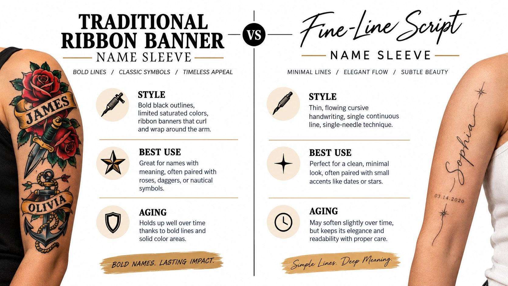
Where fine-line script succeeds and fails
Fine-line script works best when the handwriting has emotional value and the artist adapts it instead of tracing it blindly. A child's note, a parent's signature, or a memorial card sample can all become the basis for the tattoo, but the final version still needs to fit the arm's curves and leave enough breathing room around each letter.
Inner forearm and upper arm panels usually hold this style better than areas that get more friction. The design should read at normal social distance, not only in a close-up photo. That means opening up letters like a, e, and o, reducing extra loops, and resisting the urge to make the whole thing tiny.
Best placement: Inner forearm, upper arm, and protected areas with less daily abrasion.
Healing consideration: Fine lines can heal softly, so aftercare discipline matters. Think Tank Tattoo's tattoo aftercare guidance is worth reviewing before you book a delicate lettering piece.
What doesn't work: Long names in micro-script, decorative vines crossing through the word, or wrist placement so small that the letters merge visually.
Keep the script elegant, but don't let elegance win over legibility.
Personalization prompt
Bring a handwriting sample if you have one. Then decide this before the consultation. Do you want the name to feel private and understated, or do you want it readable without someone stepping in close? Fine-line script can do one of those especially well. It rarely does both at a very small scale.
3. Birth Flower Name Sleeve
A July larkspur can mark a daughter born that month, with her name set in small caps along the stem. That simple pairing shows why birth flower sleeves suit family, memorial, and multi-generation designs. The flowers carry the visual weight, while names become part of a connected composition rather than separate labels.
Botanical symbolism gives each flower a starting point, but the sleeve still needs to work as one image. Use a branch or vine to guide the eye from shoulder to wrist, then assign one flower to each person. Names can follow stems, sit beneath blossoms, or occupy open negative space between leaves. This arrangement lets you vary name length and importance without forcing every entry into the same shape.
Here's the kind of floral structure many clients start from:
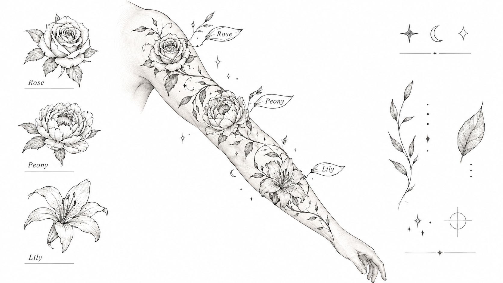
Why it's strong for multi-name sleeves
The main trade-off is readability. Layered petals, textured leaves, and thin cursive can compete for the same visual space. Keep the lettering simpler and slightly more open than the botanical details around it. Test the stencil with the arm relaxed and rotated. A name that reads clearly in one position can disappear when it crosses a curve or sits beside dense shading.
Best placement: Full forearm wraps, the outer arm from shoulder to elbow, and sleeves with gradual botanical flow.
Healing consideration: Dense petal shading may soften as it heals. Leave clear skin around each name so healed texture does not bury the letters.
What doesn't work: Matching every birth flower exactly when the result feels disconnected, squeezing long names beneath small blooms, or placing fine lettering across a heavily folded joint.
A practical family design uses one name per flower, linked by one stem system. For a memorial piece, one larger bloom can carry the primary name beneath it, while smaller flowers represent other relatives or milestones. Plan future additions before tattooing. New stems need room, and crowded gaps are difficult to correct later.
Personalization prompt
List the names by importance, then decide whether each person should receive equal visual weight. Do you want every relationship represented equally, or should one central name lead the composition? Bring the birth months, preferred flower references, and any handwriting samples to the consultation. The artist can then adjust flower scale, lettering size, and placement for long-term readability.
4. Blackwork Geometric Name Sleeve
A blackwork geometric sleeve can carry meaningful names without making sentiment the first thing people notice. Its structure comes from bands, dotwork, mandala segments, and repeating cells. Names then occupy deliberate areas, such as clean lettering in negative-space panels or shapes that divide the arm into readable zones.
Start with the arm, not the pattern. A full sleeve must account for the taper from upper arm to wrist, the elbow's movement, and how the design changes when the forearm rotates. Ask for a stencil test at the intended size. Check it with the arm relaxed, bent, and turned. A pattern that looks balanced on a flat drawing can distort on skin.
The style works well for names that need a clear visual position within a larger composition. A child's name could sit in a rectangular strip through dotwork, while several names could occupy separate panels that connect from shoulder to wrist. Keep the lettering large enough to survive healing and readable beside dark geometry.
Use the darker areas as a frame, not as competition. Dotwork, line fills, and solid black can close up around small letters. Leave clean separation around each name, especially if the sleeve includes dense mandalas or heavy bands. Readability should be tested at normal viewing distance, not only on a zoomed screen.
Placement also affects the result. The outer arm and upper arm offer broader surfaces for longer names and balanced panels. A full sleeve provides long sightlines, but the elbow and wrist need extra planning because their movement and folds interrupt straight lines. Solid black and dotwork may heal with different visual weight, so ask how the contrast will settle before approving the final stencil.
Avoid tiny names inside busy mandalas, tightly packed lettering beside black fills, and forced symmetry. The arm is curved and changes shape as it moves. A slightly adjusted panel often looks more balanced than a mathematically perfect one.
Before booking, review artist rosters experienced in geometric lettering and compare healed work where available. Bring the names, preferred lettering references, and any ideas for future additions. Extra space can prevent later names from being squeezed into leftover gaps.
Personalization prompt
Choose the first thing viewers should notice: the pattern, the names, or an equal balance. Then decide which names need the strongest visual weight. That choice guides letter size, panel width, contrast, and session time.
5. Gothic Blackletter Name Sleeve
A blackletter name across the forearm creates a formal, historical impression. Its heavy strokes and sharp details feel carved rather than handwritten. That character suits family names, memorial pieces, and designs intended to look graphic from a distance.
The same density creates a clear risk. Thick vertical strokes, narrow counters, and decorative terminals can merge when the lettering is too small or ornate. Ask your artist to stencil the exact name at tattoo size on the arm. A font that looks clear on a phone or monitor may lose separation once it follows the body's curve.
Choose a blackletter variant with room inside and between the letters. Old English inspired forms can work, provided the counters remain open after healing. A simple frame, thorn stem, or divider can separate names without competing for attention. Crosses, filigree, and dark florals should stay quieter than the lettering, especially when the design covers a large section of the arm.
A dramatic font still needs to be readable without explanation.
Placement should follow the word's length and the arm's movement. The outer forearm and upper arm usually provide flatter areas, while the wrist introduces more curvature and visual interruption. Keep long names from bending tightly around that joint. Multiple stacked names also need a clear break between them, or the sleeve can become one continuous dark block.
Healing affects the smallest details most. Heavy black areas usually retain their visual weight, but the open spaces inside letters must be large enough to remain distinct as the tattoo settles. A short consultation should cover final spelling, letter height, stencil width, expected session time, and how much negative space will remain for future additions.
A stacked family-name layout down the forearm, separated by small rose or thorn dividers, gives each name its own pause. A single surname on the upper arm leaves more room for framing and open skin.
Personalization prompt
Decide what the name represents before choosing the surrounding imagery. Should the piece feel ancestral, memorial, or purely graphic? That answer determines whether the design needs family symbols, restrained memorial details, or almost no decoration. Bring the exact spelling and mark which names deserve the strongest visual emphasis.
6. Birth Star Chart Name Sleeve
A name linked to a birth, wedding, death, or other life marker can give a sleeve a clear emotional center. The name sits within a star chart sleeve, while constellations, moons, coordinates, or selected stars establish the surrounding meaning. From a distance, the design can stay understated. Up close, the details should reward attention without competing with the lettering.
Start by deciding whether the chart represents a real sky or a symbolic one. For an astronomical reference, bring the exact date, time, and location to the consultation. A symbolic chart gives the artist more freedom, but that choice should be stated before the layout is drawn. Mixing the two approaches can produce a design that looks precise without carrying the intended meaning.
Keep the name in open skin whenever possible. A child's name can follow a constellation along the forearm, where a vertical flow suits the arm's length. A wedding date with coordinates and two names may need the upper arm, which offers more room for a focal point and supporting details. Circular chart layouts can wrap well there, but tight wrapping around the wrist may interrupt both the chart and the text.
Use visible star points rather than relying on extremely small dots. Fine details can soften during healing, and repeated points may lose separation if they are packed too closely. Dense star fields behind script, several charts forced into one small area, and decoration placed evenly across the whole arm usually reduce readability.
A quieter celestial sleeve can suit someone who wants personal symbolism without flowers or banners. It can also support memorial work when the sky imagery reinforces the memory instead of making the name feel secondary.
Before booking, confirm the spelling, chart type, focal name, placement, and expected session time. Ask how much open skin will remain for later additions. Then personalize the concept with one decision: Is the important part the person, the date, or the place? That answer determines whether the name leads the composition or anchors a larger cosmic event.
7. Family Tree Roots Name Sleeve
A family tree sleeve suits clients who want several names to remain connected rather than scattered across separate motifs. Roots can represent grandparents, the trunk can carry parents, and branches can lead toward children or later additions. The layout follows family structure, so new names can often be added without redrawing the entire sleeve.
In consultations, this is one of the formats clients most often plan to extend. The tree gives future names a defined place, but that flexibility only works when blank space is designed from the start. A crowded canopy leaves no room for additions and can make the original names harder to read.
Here's a common visual starting point for that idea:
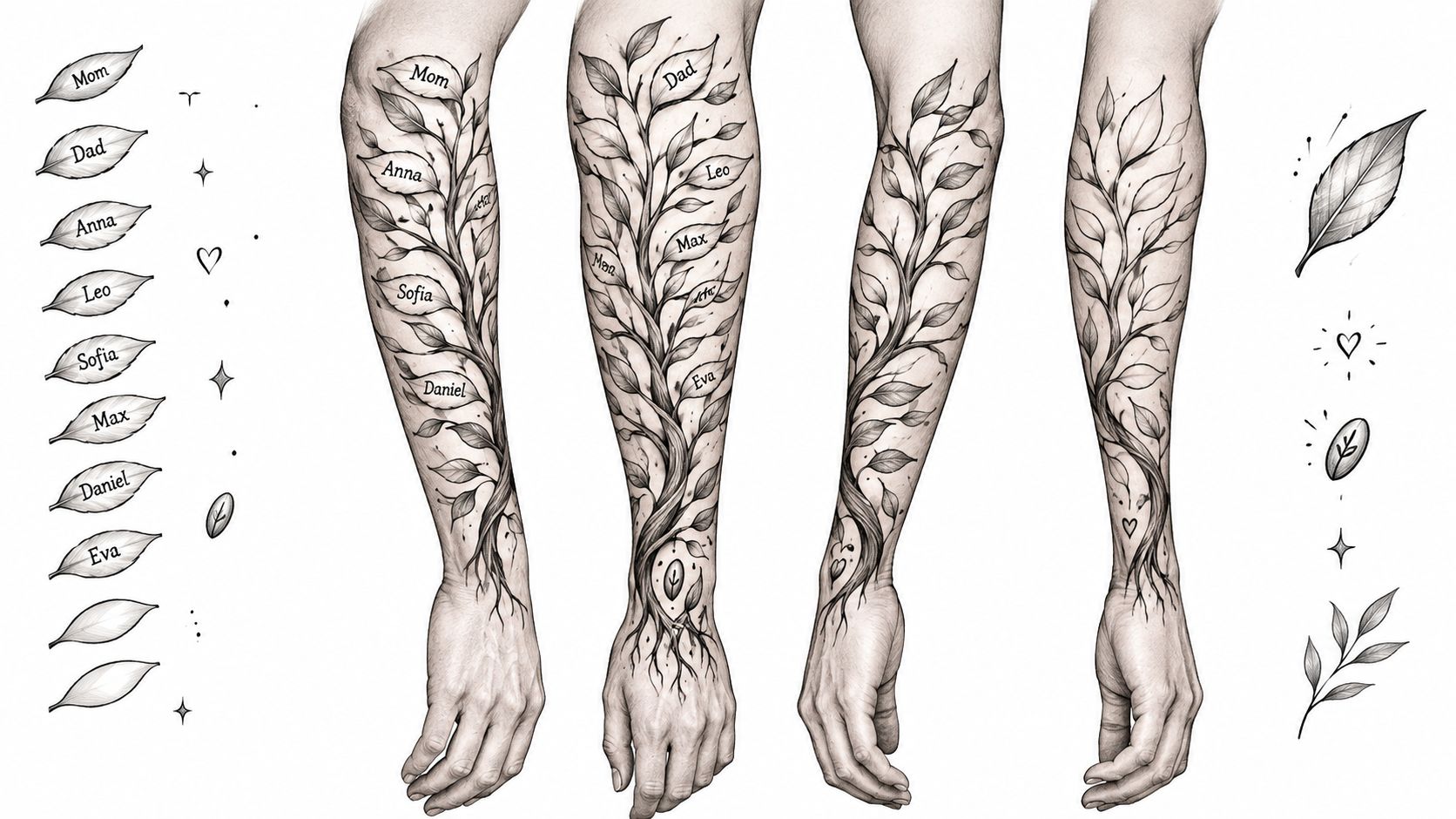
Planning for present names and future additions
Names inside leaves can work when each leaf is large enough for clear lettering. Tiny leaves with compressed script usually soften during healing and become difficult to read. Names may sit more cleanly along branches or roots, especially when the foliage is decorative rather than structural.
Placement controls the sleeve's flow. A trunk on the upper arm can widen toward the shoulder, while roots descend toward the forearm. That arrangement creates room for distinct name zones and avoids forcing every generation into one dense area.
Best placement: Shoulder to elbow for a central tree, or a full sleeve when roots and branches need room to extend.
Healing consideration: Bark texture can become visually heavy as it settles. Keep lettering away from the darkest texture and leave open skin around each name.
What doesn't work: Packing several names into small leaves or changing the generational order after the design is drawn.
Leave expansion room on purpose. In this style, blank space can protect readability and make later additions look intentional rather than attached as an afterthought.
Personalization prompt
Map the family before booking. Who belongs in the first session, and who may need space later? Confirm the spelling, relationship, and preferred placement for every name. Then decide whether the tree should feel botanical and natural or structured and symbolic. That choice affects branch spacing, root detail, lettering size, and the time needed in the studio.
8. Memorial Portrait and Name Sleeve
This is the most emotionally loaded option on the list, and it should be treated that way. A memorial portrait sleeve asks the tattoo to do two jobs at once. It has to honor the person convincingly, and it still has to function as a strong tattoo on the arm. If either part is weak, the whole piece suffers.
This style is often the right choice when the face matters as much as the name. A good portrait can carry a huge amount of emotional presence. The name then needs to support it without crowding the likeness. That usually means placing the text early in the design process, not trying to squeeze it under the portrait after the main image is already drawn.
For readers considering this route, it helps to see how memorial-focused work is approached in practice through Think Tank Tattoo's in-memory tattoo page.
Photo quality and composition matter more than people expect
Bring the best reference photo you have. Good lighting, a clear angle, and visible features matter more than sentimental attachment to a blurry picture. If the source image is weak, the tattoo artist has less to work with. That doesn't mean the piece can't happen. It means the design may need to rely more on symbolic elements, like flowers, clocks, handwriting, or a bannered name.
Here's a memorial-focused visual reference to consider while you think about placement and composition.
The name usually works best below, beside, or on a separate ribbon or plaque element. Putting script directly across a portrait often weakens both. Forearm memorials can be very visible and personal. Upper arm portraits usually allow better facial scale and smoother shading.
Best placement: Upper arm for larger portraits, forearm for a portrait-plus-name memorial panel.
Healing consideration: Portraits often need patient healing and sometimes staged follow-up work before adding surrounding sleeve elements.
What doesn't work: Low-quality photo references, overstuffed memorial symbolism, or placing text where it cuts through the face.
Personalization prompt
Decide the emotional center first. Do you want people to recognize the person's face immediately, or do you want the name and the memory to lead the piece? The answer changes scale, placement, and whether a full portrait is even the right call.
8-Style Name Sleeve Comparison
Style | Implementation Complexity 🔄 | Resource Requirements ⚡ | Expected Outcomes ⭐ | Ideal Use Cases 💡 | Key Advantages 📊 |
|---|---|---|---|---|---|
Traditional Ribbon Banner Name Sleeve | Moderate, layout + banner flow | Moderate time; color inks; experienced traditional artist | 4⭐, bold, long-lasting legibility | Classic name displays, forearm/upper arm pieces | Bold, readable from distance; durable; flexible layout |
Fine-Line Script Name Sleeve | Low–Moderate, precision single-needle work | Shorter sessions but needs skilled fine-line artist | 3⭐, elegant and subtle; less durable long-term | Memorial/partner/child names; professional settings | Understated, personal handwriting; easy to expand |
Birth Flower Name Sleeve | High, complex composition and flow | Longer sessions; color or fine-line botanical skills | 4⭐, artistic, cohesive; color may need touch-ups | Family multi-name sleeve with soft, natural aesthetic | Adds symbolism; integrates multiple names organically |
Blackwork Geometric Name Sleeve | High, precise geometry and dotwork | Long sessions; heavy black ink; specialized blackwork artist | 4⭐, high contrast, modern wearable art | Contemporary, graphic sleeves; strong visual statement | Strong contrast; expandable; black ages predictably |
Gothic Blackletter Name Sleeve | Moderate, precise lettering and spacing | Moderate sessions; solid black ink; legible font choice | 3⭐, striking and dramatic; readability varies | Edgy, historic, or heavy-metal inspired designs | Distinctive look; bold contrast; dramatic presence |
Birth Star Chart Name Sleeve | High, requires accurate mapping & composition | Research + fine-line/dotwork skills; multiple sessions | 4⭐, highly personal and symbolic; dots may fade | Date/location-specific memorials or birth tributes | Deeply personal; airy composition; symbolic accuracy |
Family Tree Roots Name Sleeve | High, large, evolving composition | Multiple sessions; realistic or illustrative skill set | 4⭐, clear narrative and scalability | Multi-generation family sleeves; storytelling pieces | Scalable for additions; strong narrative framework |
Memorial Portrait and Name Sleeve | Very high, realism demands precision | Extensive sessions; top-tier portrait artist; high-res photos | 5⭐, emotionally powerful if well executed | Memorial tributes honoring a deceased loved one | Combines likeness + name; highly meaningful and lasting |
Turn Your Favorite Style Into a Booked Consultation
The best next step is simple. Narrow your shortlist to one or two styles, not all eight. Then gather the materials those styles need. That might mean exact name spellings, dates, handwriting samples, portrait photos, family order, or celestial reference details.
This part matters because sleeves are a major commitment, not a casual add-on. A 2024 clinical review reports that about 30% of Americans have tattoos, and research across industrialized countries has commonly reported prevalence around 10% to 20% since the early 2000s, with an upward trend, which tells you tattoos are mainstream enough that sleeve planning should be treated like a serious adult design decision, not an impulse move, according to the clinical review of tattoo epidemiology and complications. With a name sleeve, that planning matters even more because text is hard to revise cleanly once it's built into a large composition.
That same body of research also supports being honest about permanence and life changes. A 2024 cross-sectional study found 58% of respondents regretted at least one tattoo, 66.3% wanted one or more removed, and 42.5% had attempted removal, with reasons including cultural concerns, poor artwork, and getting tattooed young. The study is geographically specific and shouldn't be generalized to every client in Denver, but it's still a strong reminder to build in contingency, as discussed in the analysis of permanence, regret, and removal considerations. In practical terms, that means comparing full names against initials, symbols, dates, or modular layouts that still hold meaning if life changes.
Reference gathering helps too. Pinterest reported more than one billion tattoo-related searches and billions of saved tattoo designs, with tattoos ranking among its top search categories from 2016 through 2018, which supports using inspiration boards to identify patterns in what you like rather than copying one saved image outright, as shown in Pinterest's global tattoo report. For a sleeve, I'd organize references by function. One folder for lettering. One for filler texture. One for framing elements. One for transitions between upper and lower arm.
If you're ready to turn ideas into a plan, Think Tank Tattoo in Denver offers complimentary consultations by phone or email to discuss design direction, placement, and timing. The studio is on South Broadway, the non-refundable deposit is $100, the shop minimum is $100, and services are available to clients 18 and older, with current details available through Think Tank Tattoo. Bring a tighter brief than you think you need. That's how a name sleeve starts looking like a real piece instead of a folder full of disconnected ideas.
If you want help turning names, dates, handwriting, or memorial references into a sleeve that will still read well later, Think Tank Tattoo can walk you through style choice, placement, and session planning in a complimentary consultation. Visit Think Tank Tattoo to review the shop, contact the team, and book the next step with a clear direction.
Comments