
Bold Fonts for Tattoos: What Lasts and What Blurs
The most repeated advice about bold fonts for tattoos is that heavier is safer. Thick strokes, the reasoning goes, survive as ink spreads, so pick the boldest version of the lettering you like and let the years sort themselves out. That advice gets people into trouble, because what keeps a bold tattoo readable isn't the thickness of the line. It's the space the line leaves behind.
Look at what fails on a ten-year-old name. The strokes are usually still there. What's gone is the hole in the a, the gap between the r and the i, the sliver of skin that separated two letters when the piece was fresh. Ink spreads outward from every line, so every enclosed space shrinks, and the heaviest weights give those spaces the least room to shrink into.
I judge bold lettering by one test: how the phrase reads at healed size, on that specific patch of skin, from normal social distance. Not on a tablet mockup at 300 percent zoom, and not by how much black sits in the font file. A forearm name and a finger word need different answers, and sometimes the bolder weight is the wrong call.
What follows is the sizing I start from, the typefaces that survive the trip, and the paper test that settles the choice before a needle is loaded.
Table of Contents
Starting Sizes and Stroke Weights by Placement - Reading the Table Row by Row - Where the Stroke Numbers Come From
Why Heavier Is Not Always More Readable - What That Means on Skin
Bold Typefaces That Hold Up at Tattoo Sizes - A Short Selection Checklist
Counters, Spacing and the Pre-Needle Test - The Eight-Step Pre-Needle Test
How Placement and Wear Change Bold Lettering - Friction Does More Damage Than Any Font Choice
Client and Artist Customization Checklist - For Artists - For Clients
Book a Bold Lettering Consult at Think Tank Tattoo - How to Reach the Shop
Starting Sizes and Stroke Weights by Placement
Set the scale first, then choose the weight. Size buys more readability than thickness does, and it decides how much room each letter has inside itself once the ink settles.
Reading-performance research lines up with that order. Type size has a larger effect on readability than boldness alone. Bold type still helps when the letters are already big enough to keep their interiors open. It will not save a phrase drawn too small for the skin it sits on.
Starting letter height and stroke width by placement
Placement | Starting letter height | Notes |
|---|---|---|
Outer forearm | 3-5 cm | Best for longer phrases; room for open counters |
Upper arm, thigh or calf | 4-6 cm | Good for names and short phrases; the largest flat-ish canvas, easiest to keep counters open |
Ribs or sternum | 2-3 cm | Skin stretches with breathing; keep words short |
Inner wrist or ankle | 1.5-2.5 cm | Test at healed size; avoid dense capitals |
Fingers or hands | 1-1.5 cm | Single words only; expect earlier touch-ups |
Reading the Table Row by Row
The outer forearm is where long phrases live. At 3 to 5 cm letter height you can run eight to twelve characters in a line and still leave daylight inside every a and e. That is the placement I'd pick for a quote someone has to read across a table.
Upper arm, thigh, and calf move to 4 to 6 cm. More uninterrupted surface, less bony contour. That extra centimeter lets a name or a short phrase keep proper spacing instead of being squeezed to fit.
Ribs and sternum drop to 2 to 3 cm because the skin moves with every breath and the surface curves hard. A long line wraps that curve in ways a flat design never shows. Short words. Wider gaps.
Wrists and ankles sit at 1.5 to 2.5 cm. Test the phrase at healed size rather than trusting the stencil. The skin is thin, close to bone, and often seen at an angle, so dense capitals with tight interiors are the first thing I'd change.
Fingers and hands get 1 to 1.5 cm and one word. Anything longer turns into overlapping letters at that scale, and those pieces need earlier touch-ups.
Where the Stroke Numbers Come From
Stroke width is not a millimeter figure pulled off a chart. Low-vision typography measures it as a ratio against the lowercase x-height, so once the x-height is set for a placement, the stroke follows in proportion. At the smallest end of the table that ratio lands around a millimeter or less. Finger lettering needs a face drawn heavy, not a light face scaled down.
Working rule: if a phrase looks cramped on paper, move up a row before you change the font.
Pick the body area, find its row, and write down the target letter height. Treat every number as a range to test on that skin, not a specification. Measure the curve of the placement, set the x-height inside the range, then apply the same stroke-to-x-height ratio. Stand back to normal viewing distance. If the counters already look tight on paper at that height, the heavier weight is the wrong next move.
Why Heavier Is Not Always More Readable
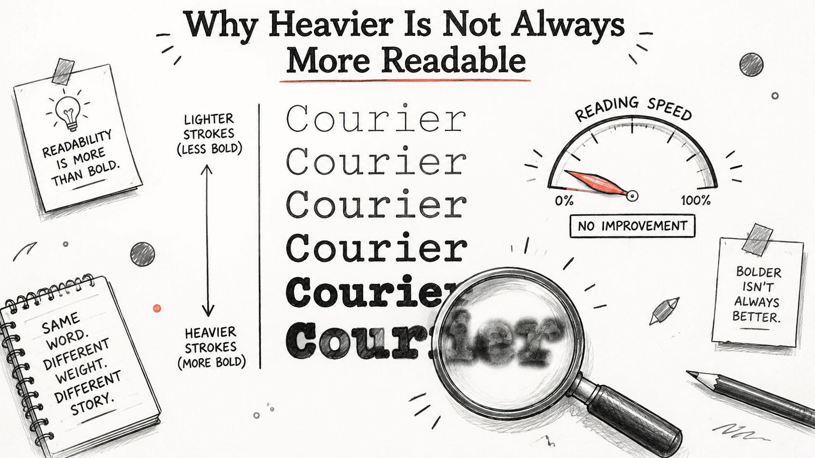
The myth is that the heaviest weight is the safe weight. Type research says otherwise. A 2013 peer-reviewed study tested six levels of stroke boldness in Courier type, from 0.27× to 3.04× the standard stroke weight, and read them under both central and peripheral viewing conditions. Reading speed didn't improve at any bolder level. Performance stayed broadly steady through the middle of the range, then fell hard at the top: a 21.5% reduction at 1.89× standard boldness and a 51% reduction at 3.04×, an average decline of about 23.3% at the most extreme weights, as reported in the study on stroke boldness and legibility.
The same tension shows up whenever you compare lettering styles, which is why the difference between fine line and bold line work comes down to the same trade between detail and durability.
Here's the effect in visual terms:
What That Means on Skin
Counters are the enclosed holes in letters like A, B, R and e. A bold stroke grows inward as well as outward, and years of pigment spread push it further in. The hole closes first, then the letter stops being a letter and becomes a dark shape with a bump on it.
Think of a coloring book page printed with a very fat outline. At some point the white inside is gone and there's nothing left to read but the border.
Weight buys visibility only until it starts closing the spaces between letters.
Peripheral vision is the part worth noticing. The 2013 study found excessive stroke thickening impaired recognition most outside the central field of vision, which is where most of your tattoo's audience reads it: walking past, sitting across a table, catching it at the edge of their gaze while you gesture. The useful zone is moderate to heavy. Past that, the design starts working against itself.
Before you commit, set the same word in three weights of one typeface on paper, at the letter height from the placement table, and read all three from two meters away. The middle weight usually wins.
Bold Typefaces That Hold Up at Tattoo Sizes
Three families earn their place at tattoo scale, and they earn it for the same structural reasons.
Wide bold grotesques and humanist sans-serifs. Univers, Helvetica Neue Bold, Franklin Gothic, Gotham. What they share is an open aperture and a stroke that gains weight without being compressed sideways, so the o and the e stay round instead of turning into slots. At 3 cm on an outer forearm, a name set in Univers Bold still shows space inside every letter.
Plain slab and sturdy display faces. Rockwell Bold, Clarendon, Cheltenham Bold. Thick slabs, simple interior shapes, no hairlines to disappear. They hold up where a geometric sans starts to look mechanical.
Bold scripts, but only when the joins stay thick. American traditional script works because the connector strokes carry as much weight as the letters themselves. A fine-joined script, where the entry and exit strokes thin out to nothing, is the one case where "bold script" is a contradiction.
Put three representative cases side by side and the pattern is obvious. A wide bold sans with a round o and e keeps every counter open at 3 cm. A condensed black display face fills the same counters at the same height and reads as a dark block from across the room. A blackletter or a thin-joined script loses its interior shapes entirely once the ink softens.
A Short Selection Checklist
Open counters at tattoo size. If the a and the e still show space in a printout at final height, the face is a candidate.
A visible difference between a and e. Two letters that collapse into the same silhouette destroy a phrase.
A moderate x-height with a stroke that stays proportional to it. Fat strokes on a tall x-height crowd the interiors fastest.
No swash that enters a letter's interior. Decoration outside the letter is fine. Decoration inside it steals counter space.
Joins as heavy as the strokes. In any script, the connective tissue is where a tattoo fades into a line of ink.
Bring the names into the consultation and have the artist draw them at the actual placement size. A font that looks superb in a specimen sheet can be the wrong choice at 2 cm.
Counters, Spacing and the Pre-Needle Test
Whether a counter survives is the whole game. Typography research on signage finds that increasing stroke width improves distance visibility while shrinking counters, so the boldest display faces are often the ones that differentiate letters least, per this analysis of signage typeface design. The same source reports that low-vision typography finds improved legibility with stroke widths around 22-33% of the lowercase x-height, while the median bold typeface measured approximately 26.1%. Those figures are proportional benchmarks for stencil development, not needle specifications.
The consequence is practical. A condensed heavy display word at 3 cm turns into a dark block. A wide bold sans at the same height keeps every letter separate, because its strokes stay inside that proportional band while its interiors stay open. Compressed bold faces, tight kerning and hairline interior details all work against you as the tattoo heals and softens.
Here's the part most guides skip:
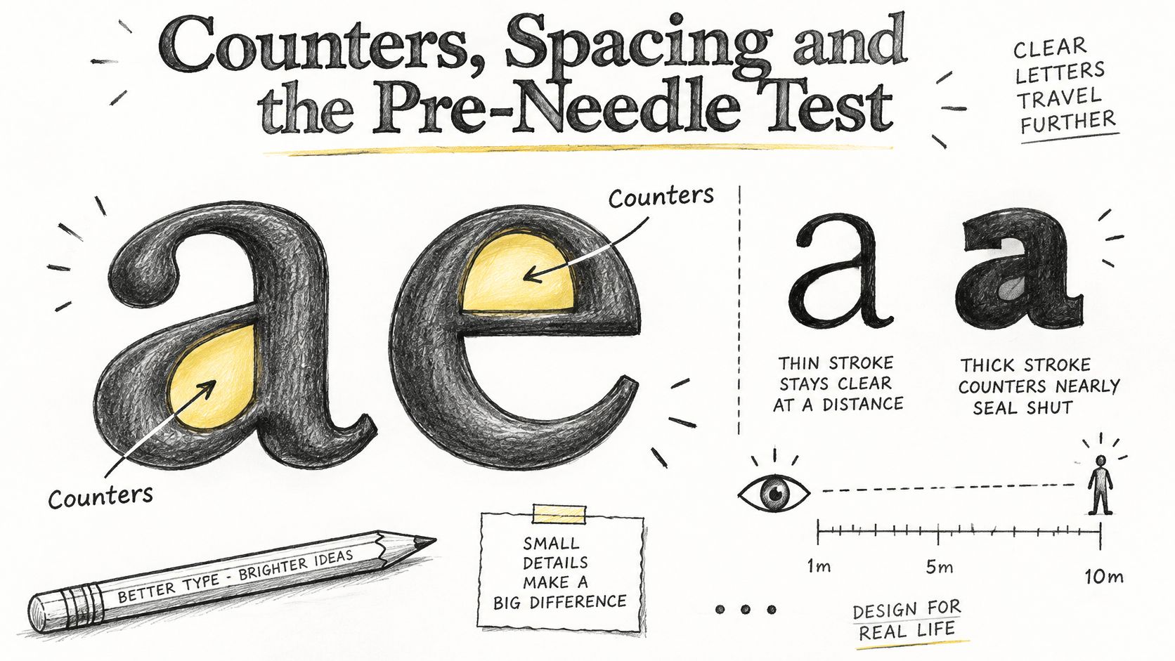
The generic minimums people repeat, roughly 1-1.5 cm letter height or a 2.8-4.0 mm x-height, get presented as broad rules when they're really variables to test against skin curvature, letter density and the wearer's own ability to read the thing. This tattoo font guide recommends thick strokes and open counters but never answers how bold is too bold for a specific area, phrase length and viewing distance.
Spacing follows the same logic. Experiments in typography find that thinner strokes reduce recognition at small visual angles while extreme boldness can also reduce recognition, with the benefit of added weight strongest when text is physically small or viewed from farther away, per this research on bold text and legibility. A digital typography guideline cited there recommends character spacing of at least one stroke width. On a curved forearm, measure that gap on the skin, not on the flat mockup, because curvature and movement visually compress it.
There's no universal minimum size. The test result beats the font name every time.
The Eight-Step Pre-Needle Test
Choose the phrase and two or three weights of one typeface. Comparing weights of the same face isolates the variable you're deciding.
Set each version at the letter height from the placement table and print at actual size. A screen at 100 percent is not actual size on a 27-inch monitor.
Measure the smallest counter and confirm it stays open. That's the a, the e, the R. If it's a pinhole now, it will be gone later.
Check for at least one stroke width of space between neighbors. Counters and gaps fail together, so test them together.
Tape the printout to the placement and read it from arm's length, then from across the room. The piece has to work at the distance strangers see it.
Shrink the mockup slightly to imitate softened lines, then look again. Five percent is enough to show you which letters are already borderline.
Pick the lightest weight that still reads at distance, and remove hairlines. Lighter-but-open beats heavier-but-clogged, and hairlines are the first detail to vanish.
Convert the final design to outlines and get sign-off before tattooing. Outlined letterforms let the artist bend the text to the body contour instead of applying a flat font to a curved surface.
How Placement and Wear Change Bold Lettering
Bold lettering is judged by how it reads at healed size, on the actual placement, and at a normal viewing distance. Stroke thickness is one variable. Movement, friction, ultraviolet exposure, and aftercare can outweigh the type choice, so match the phrase to the wear on that skin before you commit to it.
Main wear factor by placement
Placement | Main wear factor |
|---|---|
Fingers or hands | Friction, frequent washing, hand use |
Feet or ankles | Shoe friction, sweat |
Ribs or sternum | Stretching with breathing, clothing rub |
Inner wrist | Thin skin, constant movement |
Outer forearm | Sun exposure |
Back of neck | Sun exposure, collar friction |
Friction Does More Damage Than Any Font Choice
Each of those forces works on a different schedule. Fingertip lettering lives against keys, steering wheels, and soap. The outer forearm spends summers in short sleeves. A bold design buys some durability against ink spread. A waistband or a shoe still scrapes the same letters for years.
Finger and hand lettering may need earlier touch-ups and can still heal unevenly even when the design is bold, as this guide to tattoo aging points out. A touch-up has a ceiling. Once letters have spread or a counter has closed, adding ink usually makes the block darker rather than the letter clearer.
Sun is the force you keep managing for decades. Pigment breaks down under ultraviolet exposure, and understanding how sunscreen filters UVA and UVB is the cheapest long-term protection a tattooed arm can get. The mechanics behind slow drift are worth twenty minutes before you settle on a placement: why tattoos fade over time explains it plainly.
No credible source can promise a fixed lifespan for lettering. Any aging timeline you see is a model, not an expiry date.
Answer four questions before the consultation. What does your job do to your hands? How much direct sun does this placement get? How much do you sweat, and where? Will you book touch-ups, or will you live with what you get? I would let those answers pick the placement. Then read the phrase at the softened size you will see from across a room. Open letters on a high-wear spot hold up better than extra weight on skin that friction or sun keeps working.
Client and Artist Customization Checklist
Custom work isn't a niche. Marketing Scoop reported that custom-designed tattoos accounted for 59.3% of tattoo-industry revenue in 2025, citing IBISWorld, in its tattoo industry statistics roundup. Since lettering is the most common custom request, the difference between a phrase that reads for thirty years and one that turns into a bar usually gets made at the consultation table.
For Artists
Draw the letterforms instead of dropping in a stock font. Hand-drawn shapes bend to the body's contour, and a stock face placed on a curved forearm distorts at the edges.
Offer two or three weights of the same design. Clients can't judge a weight in the abstract. They can judge three versions of their own phrase in ten seconds.
Flag blackletter and dense capitals before the stencil. Say the words "these will crowd at this size" while there's still time to change it.
Simplify decorative swashes that enter a letter's interior. A flourish outside the letter adds character. One inside it costs a counter.
For Clients
Bring the exact phrase, spelled out in writing. Including capitalization and punctuation. Text a photo of it so nobody transcribes a name wrong.
Decide whether readability or stylistic detail wins if they conflict. You can't have maximum flourish and maximum longevity in the same 3 cm.
Don't stack four lines in a small area. Each added line shrinks the counters around it and forces the whole block smaller.
Ask how the studio handles touch-ups, and what it can and can't promise. A straight answer here tells you a lot about the shop.
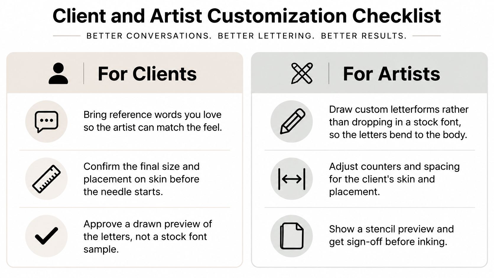
Run the eight-step test before any of this goes to stencil. Feedback rounds also go better when you know how our design feedback process works, since most rewrites are about counter space and letter height rather than taste.
Book a Bold Lettering Consult at Think Tank Tattoo
Bold lettering fails when it only looks heavy on a screen. It has to read at the healed size, on the placement you chose, from a normal viewing distance. Stroke weight alone will not settle that.
Think Tank Tattoo focuses on custom designs and craftsmanship. In a complimentary consultation, the artists work with you on design direction, placement, and timing, so you can compare two or three weights of the same lettering before you commit. The studio has been in business since 2002 and works in a 3,000 square foot shop at 172 S. Broadway, Denver, CO 80209. Clients must be 18 or older.
A consult is a design decision, not a font browsing session. You are checking whether the letters still separate on a forearm, a rib, or the side of a hand, and whether the open spaces inside them stay clear once the piece heals. On a curved placement, a heavier stroke can close those gaps even when a flat printout looked fine.
How to Reach the Shop
Call or text (720) 932-0124, or email thinktanktattoo@gmail.com. Hours are Tuesday through Saturday, 12pm to 8pm. Appointments are booked by calling or emailing the shop. The shop minimum is $100, and a non-refundable $100 deposit is required before a tattoo appointment is reserved. Do not send that deposit until an artist or staff member directs you to pay.
Come with the phrase already checked at the letter height from the sizing table. If the line is long and the spot is small, the height has to come down or the wording has to shorten. No font guarantees how the tattoo will age.
I would send both the phrase and the placement when you request the consult. Visit Think Tank Tattoo and start with the height you want the letters to hold.
Comments