
10 Tattoos with Color to Inspire Your Denver Design
You know you want a tattoo with color, but the decision gets harder when every reference image suggests a different direction. One design may use soft watercolor blending, another may rely on bold neo-traditional structure, while a realistic portrait demands a completely different approach to detail, scale, and placement. The right choice is not merely the brightest palette. It depends on the mood you want, the subject that matters to you, how much detail the body area can support, and how you're prepared to care for the tattoo over time.
This gallery compares 10 colorful tattoo styles, from expressive watercolor and illustrative work to Japanese compositions, geometric mandalas, botanical designs, and sunset gradients. Each style behaves differently as it wraps around the body, catches light, and changes with age. You'll also find practical guidance for choosing a palette, planning a multi-session project, and preparing for a consultation in Denver. Think Tank Tattoo offers complimentary consultations where you can discuss design direction, placement, and timing before booking.
Table of Contents
1. Watercolor Tattoos - Best For and Trade-Off - Planning Tip
3. Neo-Traditional Color Tattoos - Best For and Palette Planning - Planning Tip
4. Illustrative and Sketch-Style Tattoos - Best For and Trade-Off - Planning Tip
5. Japanese Color Tattoos - Respect, Scale, and Movement - Planning Tip
6. Geometric and Mandala Color Tattoos - Best For and Trade-Off - Planning Tip
7. Biomechanical Color Tattoos - Building the Illusion - Planning Tip
8. Floral and Botanical Color Tattoos - Best For and Meaning - Planning Tip
9. Pop Art and Comic-Style Color Tattoos - Best For and Trade-Off - Planning Tip
10. Sunset, Gradient, and Sky-Themed Color Tattoos - Best For and Trade-Off - Planning Tip
Turn Inspiration Into a Wearable Plan - Check the Design Against Your Body - Use the Consultation to Resolve the Unknowns - Understand Pigment Choices and Regulation
1. Watercolor Tattoos
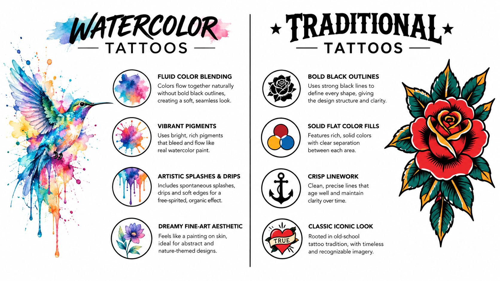
Watercolor tattoos borrow the visual language of painted washes, fluid edges, layered pigment, and splashes that appear to move beyond the main subject. Instead of depending on a heavy outline, the design may use color transitions and open skin to create its shape. A lotus, bird, butterfly, abstract scene, or celestial composition can feel light, modern, and expressive in this format.
The style works particularly well when you want the tattoo to communicate mood rather than strict realism. A watercolor mountain scene can suggest atmosphere with a few overlapping hues, while a floral piece can let each petal dissolve into the next. On a forearm or thigh, the open composition can follow the natural length of the body without looking boxed in.
Best For and Trade-Off
Best For: Nature subjects, abstract concepts, dreamy imagery, and clients who want a fine-art influence.
Trade-Off: Soft edges and lighter saturation can become less distinct as the tattoo ages, especially in areas exposed to sunlight or repeated friction. Sun exposure is a major factor in fading, and newer ink chemistry may support longevity, but the final result still depends on pigment, skin, placement, and aftercare. Current tattoo trend coverage discusses sun exposure, pigment longevity, and softer gradients.
Planning Tip
Ask to see healed watercolor work, not only fresh photographs. Discuss how much contrast you want between the subject and the surrounding splashes, and consider a lower-friction location if preserving delicate color is a priority. A consultation about saturation and future touch-ups can help you choose between a very airy wash and a more structured watercolor design. For an example of the style, explore this watercolor lotus tattoo approach.
2. Realism and Portrait Tattoos
Color realism aims to make a tattoo feel dimensional through accurate anatomy, controlled shadows, highlights, and carefully layered hues. Portraits take that challenge further because a small change in the eyes, mouth, or facial proportions can alter the entire likeness. The same principle applies to animal faces, memorial pieces, still life, and realistic flowers.
A portrait of a family member may need a stable area such as the upper arm, thigh, or outer forearm, where the skin can support a clear focal point. Joints and high-movement areas can interrupt the composition and make fine details harder to read. Large realism projects also need room for tonal transitions, so shrinking a detailed reference too far can weaken the result.
Choosing the Reference
Bring a clear, high-quality reference photo and be open to adjusting the crop, pose, lighting, or surrounding imagery. Your artist needs to translate a two-dimensional reference onto curved, living skin, not reproduce every photographic detail at any size.
Best For: Memorial portraits, beloved animals, meaningful people, and clients who want a lifelike result.
Trade-Off: Realism demands careful artist selection, appropriate scale, and patience across multiple appointments. A strong portfolio should show finished work and, ideally, healed examples. Review an artist's completed portrait work through this guide to finding a good portrait tattoo artist.
A realistic tattoo can also combine a face with flowers, dates, scenery, or symbolic objects. Keep the central subject dominant, then use supporting color to guide the eye rather than competing with the portrait.
This video offers another visual reference for comparing colorful tattoo approaches and their structure.
3. Neo-Traditional Color Tattoos
Neo-traditional tattoos keep the strong outlines and readable silhouettes associated with traditional tattooing, then add more elaborate shading, dimension, and color variation. A rose may include several layers of red and pink, a bear may have sculpted facial planes, and a skull can sit inside a rich composition of foliage, fabric, or ornamental detail.
This structure gives color somewhere to work. Bold outlines separate adjacent hues, while deliberate shadows prevent a complex design from becoming visually muddy. The style suits animals, flowers, skulls, characters, and symbolic objects, particularly when you want the tattoo to remain recognizable from across a room.
Best For and Palette Planning
Best For: Clients who want vivid color, strong readability, and a design that can grow into a sleeve or larger collection.
Trade-Off: Neo-traditional work often looks strongest when the palette is planned as a system. Too many unrelated hues can weaken the hierarchy, while a limited group of complementary colors can make the focal subject stand out.
A tattoo application guide recommends a minimum palette of 4 to 6 colors for neo-traditional work, giving the artist enough range for separation, shading, and emphasis. The color tattoo guide explains palette planning and color-packing technique.
Planning Tip
Choose the subject first, then decide which colors should dominate, support, or remain occasional accents. If you're building a sleeve, leave intentional space for future additions and repeat selected colors across separate designs. That repetition can make individually tattooed pieces feel connected without forcing every image into one scene.
Neo-traditional color is also a practical option when you want expressive imagery with more visual durability than a very delicate, low-contrast design. It still needs sun protection and aftercare, but its outlines and clear color blocks give the composition a strong foundation.
4. Illustrative and Sketch-Style Tattoos
Illustrative tattoos feel like drawings translated directly onto the body. They may combine varied line weights, loose marks, selective shading, and small areas of color that appear intentionally unfinished. A literary image might look like a page from an illustrated storybook, while a botanical design can pair delicate leaves with energetic, hand-drawn contours.
The appeal is personal and artistic rather than strictly polished. A sketch-style fox, figure, character, or strange little creature can preserve the feeling of a working drawing instead of presenting a completely smooth, rendered surface. Selective color can create a focal point, such as a red flower in an otherwise black-and-gray composition.
Best For and Trade-Off
Best For: Clients who want a one-of-a-kind drawing, expressive linework, or an image that feels connected to illustration, books, animation, or concept art.
Trade-Off: The style depends on interpretation. If you expect every line to look mechanically uniform, the natural variation may feel less finished than you intended. Clarify whether you want loose sketch marks, polished illustration, or a combination of both.
Planning Tip
Bring references that show the line quality and mark-making you like, not only the subject. A client who says “I want a colorful flower” could mean a realistic peony, a loose ink drawing, or a graphic flower with one bright accent. Discuss how the design will sit on the body and whether the lines need to follow a limb's length or wrap around its movement.
Illustrative tattoos can also support gradual collection building. Start with one subject, then add related drawings later using a shared line style or accent palette. The result can feel curated without looking repetitive.
5. Japanese Color Tattoos
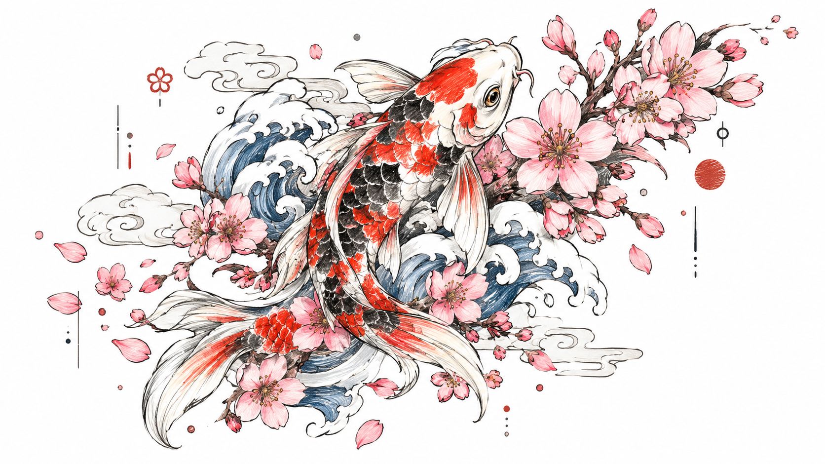
Japanese tattoo art uses bold imagery, flowing composition, and symbolism that can extend across the body. Koi, dragons, cherry blossoms, samurai, clouds, waves, and oni can be arranged so the design follows the direction of a limb or wraps around the torso. Color isn't added randomly. It supports the subject, separates overlapping forms, and helps the whole composition move with the body.
A koi sleeve may use water to connect the forearm and upper arm, while blossoms can guide the eye through open spaces. A dragon back piece can use clouds and wind bars to frame the main figure rather than leaving isolated images floating on the skin.
Respect, Scale, and Movement
Best For: Clients interested in substantial compositions, cultural symbolism, and artwork designed around the body rather than placed on it as a standalone sticker.
Trade-Off: Large Japanese-inspired work requires commitment to scale, composition, and artist expertise. Reducing a complex scene to a small area may remove the breathing room that gives the style its impact.
Research the meaning of individual elements before combining them. Discuss whether you want a historically grounded irezumi approach, a contemporary interpretation, or a design influenced by Japanese imagery without following every traditional convention. A skilled consultation should address cultural respect, flow, background, and future expansion.
Planning Tip
Think in terms of body zones and movement. A sleeve needs to look coherent from the front, side, and back, not only when the arm is held straight. The same principle applies to a thigh or back piece. Plan the main subject, background, and negative space together before choosing the final colors.
6. Geometric and Mandala Color Tattoos
Geometric tattoos depend on alignment, repetition, symmetry, and controlled spacing. Color can fill individual sections of a mandala, create a kaleidoscopic effect, or separate overlapping shapes within a sacred geometry design. A geometric fox or lion can combine recognizable anatomy with triangles, arcs, and facets.
Mandalas often work well on the forearm, thigh, calf, or back because those areas can provide enough visual space for the circular structure. The design may look symmetrical when viewed straight on, but the body is curved and constantly moving. That makes placement planning just as important as the pattern itself.
Best For and Trade-Off
Best For: Clients drawn to mathematical structure, meditative symbolism, precise repetition, and highly organized color.
Trade-Off: Geometry leaves little room for casual changes after the design is finalized. A small shift in spacing or alignment can affect the appearance of the entire pattern, and modifications may be difficult once the tattoo is underway.
Planning Tip
Bring examples that show the exact kind of geometry you prefer, such as floral mandalas, interlocking triangles, radial patterns, or animal forms built from facets. Ask how the artist will map the design around the body and how color will reinforce the symmetry.
A palette can be restrained or vivid, but it should be selected early. In a geometric tattoo, color blocks are part of the architecture, so changing one hue may affect balance across the entire design. Explore ideas for sacred geometry tattoo designs before your consultation.
7. Biomechanical Color Tattoos
Biomechanical tattoos create the illusion that machinery, circuitry, or robotic parts exist beneath the skin. Organic textures can transition into gears, cables, plates, wires, and mechanical organs. Color intensifies the illusion by separating metal from tissue, adding neon accents, or creating cool futuristic shadows.
A biomechanical sleeve needs enough space for the viewer to understand what is happening beneath the imagined skin. On a narrow area, too many small components can merge into visual noise. A larger upper arm, calf, chest, or back can support stronger transitions from organic surface to mechanical interior.
Building the Illusion
Best For: Science-fiction enthusiasts, technology-minded clients, and anyone drawn to surreal hybrid imagery.
Trade-Off: The style is detail-heavy and depends strongly on composition. Metallic color alone won't create a convincing mechanical effect. The artist must control highlights, depth, edges, and the direction of each component.
Planning Tip
Decide whether the design should feel industrial, medical, robotic, alien, or cyberpunk. Those choices affect the palette. Gunmetal grays and cool blues create a different mood from neon green, electric purple, or warm copper accents.
Bring references for the machinery and the surface texture you like, but let the artist adapt them to your anatomy. A shoulder, elbow, or knee can become part of the design's movement instead of an obstacle. Complex biomechanical work may require several appointments, so discuss the order of sections, healing time, and how each session will connect to the next.
8. Floral and Botanical Color Tattoos
Floral tattoos offer one of the most adaptable paths into color. A single rose can be compact and graphic, while a botanical sleeve can combine leaves, stems, seed pods, insects, and several flower species. You can choose realistic color, stylized color, or an illustrative treatment that uses loose linework and selective saturation.
The subject also carries built-in movement. Stems can follow the length of an arm, blossoms can open toward the shoulder, and leaves can fill negative space without making the composition feel crowded. A flower's natural shape can guide the design around a curve more gracefully than a rigid emblem.
Best For and Meaning
Best For: Nature lovers, clients seeking meaningful personal symbols, and collectors who want a design that can expand over time.
Trade-Off: Highly detailed petals and leaves need enough scale to remain distinct. A small flower with many overlapping layers may lose the separation that made it attractive in the reference image.
Choose flowers for their visual structure as well as their symbolism. A client might select a peony for its layered petals, a sunflower for its strong center, or a wildflower group for a less formal composition. You can also add a bird, moth, bee, or meaningful plant without overwhelming the primary subject.
Planning Tip
Decide whether the color should look botanical or interpretive. A realistic palette may suit a portrait-like orchid, while unexpected blues and purples can turn a familiar flower into a more personal image. Discuss how the piece will connect to existing tattoos, particularly if you may build a sleeve later.
Floral work can be designed as a standalone statement or as a flexible first addition to a larger collection. Leave enough breathing room around the main bloom so future elements can be added without crowding the original composition.
9. Pop Art and Comic-Style Color Tattoos
Pop art and comic-style tattoos use graphic clarity, bold outlines, energetic color, and recognizable visual cues. Halftone dots, action lines, speech bubbles, exaggerated shadows, and expressive poses can make a small scene feel active. The approach suits comic characters, anime influences, graphic novel moments, stylized animals, and objects treated as personalities.
The strongest designs do more than copy a character image. They adapt the reference to the body, choose a readable crop, and decide which details need to stay visible after the tattoo heals. A dynamic superhero pose may work better on a long outer arm, while a compact graphic emblem could suit the calf or upper arm.
Best For and Trade-Off
Best For: Comic readers, animation fans, pop culture enthusiasts, and clients who want a tattoo with immediate graphic impact.
Trade-Off: A recognizable reference can make the concept accessible, but personal meaning helps it remain relevant. Consider whether you want a direct character portrait, a scene from a story, or an original design inspired by a broader visual language.
Planning Tip
Bring clear references for the specific comic or pop art direction you love. “Comic style” can mean vintage printing, modern graphic novels, manga, anime, Saturday-morning animation, or minimalist sticker art. Discuss whether the tattoo should prioritize likeness, action, humor, or color blocking.
Palette decisions matter here. Bright primary colors can create a classic graphic effect, while unusual combinations may make the design feel less tied to one era. Ask how outlines, halftone textures, and small lettering will be scaled for your chosen placement. If you want dialogue, verify that the text remains readable without overpowering the image.
10. Sunset, Gradient, and Sky-Themed Color Tattoos
Sunset and sky-themed tattoos make the transition between colors the central event. Orange can move into pink, purple, and blue, or a cool dawn palette can shift from deep navy into pale gold. The design may stand alone as a scene, support a moon or bird, or act as a background behind another subject.
Gradients look especially effective when the shape gives the colors room to spread. A forearm sunset can use the limb's length to create a horizon, while a thigh or back piece can hold clouds, stars, and layered atmospheric depth. On a small area, too many color changes may compress into a less readable patch.
Best For and Trade-Off
Best For: Clients who want a calm, contemplative image, a meaningful travel or nature reference, or a color-focused abstract tattoo.
Trade-Off: Smooth transitions require careful saturation and blending. The final design should have enough contrast to remain legible, but not so much that the gradient loses its quiet quality.
Planning Tip
Choose the emotional temperature before the exact hues. Warm sunset colors can feel nostalgic and inviting, while cool blues and violets may feel peaceful or introspective. Ask to see examples of the artist's blending technique, and discuss how clouds, stars, silhouettes, or natural scenery details will interact with the gradient.
Sun protection is especially important when the visual effect depends on subtle color relationships. Plan the placement around friction and movement, then decide whether the gradient is the main subject or a foundation for another image. That choice will determine the scale, contrast, and amount of open skin needed.
10-Style Color Tattoo Comparison
Style | Implementation Complexity (🔄) | Speed / Resource Efficiency (⚡) | Expected Outcomes (⭐ 📊) | Ideal Use Cases | Key Advantages & Tips (💡) |
|---|---|---|---|---|---|
Watercolor Tattoos | 🔄🔄🔄🔄, High skill for color blending and no outlines | ⚡⚡, Moderate; specialized pigments, touch-ups every 5–7 yrs | ⭐⭐⭐⭐ 📊 Dreamy, vibrant results; may fade/soften over time | Contemporary fine‑art pieces; nature‑themed or abstract designs | 💡Use an experienced watercolor artist; place on low‑friction areas |
Realism & Portrait Tattoos | 🔄🔄🔄🔄🔄, Extremely high technical demand | ⚡, Low; multiple long sessions, high cost, precise color matching | ⭐⭐⭐⭐⭐ 📊 Photorealistic, high emotional impact; ages well with care | Memorials, large showcase pieces, collectors seeking photorealism | 💡Bring high‑quality references; expect multiple sessions and higher budget |
Neo‑Traditional Tattoos | 🔄🔄🔄, Moderate; bold outlines with added dimension | ⚡⚡⚡, Efficient; solid colors, good longevity | ⭐⭐⭐⭐ 📊 Bold, long‑lasting visual impact; versatile at many scales | Sleeves/back pieces; collectors wanting classic‑meets‑modern looks | 💡Decide palettes early; great for cohesive sleeves and touch‑ups every 10–15 yrs |
Illustrative & Sketch‑Style | 🔄🔄🔄, Moderate; requires illustrative drawing skill | ⚡⚡⚡, Moderate; flexible session planning | ⭐⭐⭐⭐ 📊 Unique, artistic results; celebrates hand‑drawn aesthetic | Creative professionals, bespoke one‑of‑a‑kind commissions | 💡Share illustration references; prioritize artist's illustrative portfolio |
Japanese / Oriental Color Tattoos | 🔄🔄🔄🔄, High; traditional composition and symbolism | ⚡, Low; multi‑year projects, significant time and cost | ⭐⭐⭐⭐⭐ 📊 Cohesive large‑scale pieces with cultural depth; very durable | Full sleeves, back pieces, serious collectors seeking tradition | 💡Work with authentic irezumi artists; research symbolism and commit long‑term |
Geometric & Mandala Tattoos | 🔄🔄🔄🔄, High precision and mathematical accuracy needed | ⚡⚡, Moderate; requires careful stencil and placement | ⭐⭐⭐⭐ 📊 Striking, clear results that age well if precise | Symmetry lovers, spiritual/meditative designs, flat-placement areas | 💡Choose flat body areas; finalize design carefully, modifications are difficult |
Biomechanical Color Tattoos | 🔄🔄🔄🔄, High; blends organic and mechanical rendering | ⚡⚡, Moderate to low; complex, multi‑session work with specialized pigments | ⭐⭐⭐⭐ 📊 Dramatic, futuristic visual impact; best at large scale | Sci‑fi/tech enthusiasts, large statement pieces and arm/leg sleeves | 💡Pick artists experienced in both organic shading and mechanical detail |
Floral & Botanical Tattoos | 🔄🔄🔄, Moderate; varies by realism vs stylized approach | ⚡⚡⚡, Moderate; versatile sizes, generally good longevity | ⭐⭐⭐⭐ 📊 Timeless, versatile pieces with personal symbolism | Nature lovers, meaningful collections, small to large placements | 💡Choose flowers with personal meaning; discuss realistic vs stylized palette |
Pop Art & Comic‑Style Tattoos | 🔄🔄, Low–Moderate; graphic approach with bold outlines | ⚡⚡⚡, Efficient; bold colors hold well, scalable sessions | ⭐⭐⭐⭐ 📊 Highly recognizable, vibrant, personality‑driven results | Comic/pop culture fans, playful portraits, graphic statement pieces | 💡Bring clear comic/art references; work with artists experienced in halftone/graphic styles |
Sunset / Gradient & Sky‑themed Tattoos | 🔄🔄🔄, Moderate; smooth blending skill required | ⚡⚡, Moderate; blending needs expertise, possible uneven fading | ⭐⭐⭐⭐ 📊 Serene, contemplative color pieces; showcase blending skill | Small meaningful pieces or gradient backgrounds in larger works | 💡Place on flat skin areas; ask about blending technique and sun protection |
Turn Inspiration Into a Wearable Plan
A gallery can give you direction, but the best tattoo decision comes from narrowing the idea until it works on your body. Start with the visual mood. Do you want something soft and atmospheric, bold and graphic, lifelike and emotional, symbolic and structured, or playful and recognizable? That answer can eliminate styles that look appealing online but don't match the way you want the tattoo to feel in person.
Next, identify the subject and decide what must remain clear. A portrait needs a readable focal point. A geometric mandala needs spacing and alignment. A Japanese sleeve needs composition that wraps around the limb. A watercolor scene may need open space for color to breathe. The subject determines the amount of detail, and the amount of detail determines the scale.
Keep the palette intentional. You don't need to use every color you like. Choose a dominant family, a supporting family, and any accent color that deserves special attention. Ask how the colors will interact with your skin tone, existing tattoos, and the lighting of the placement. Tattoo color sits beneath the skin, so healed work won't look identical to a fresh photograph. Sun exposure can also change the appearance of pigments over time, and brighter colors may appear to fade faster on darker skin because natural melanin can overlap the visible pigment. Background on color tattoo aging, skin tone, and exposure can help frame that conversation.
Check the Design Against Your Body
Movement and friction should influence the design before the stencil is applied. A tattoo that looks perfect in a flat reference may need changes when it crosses an elbow, knee, shoulder, hip, or ankle. Ask to see how the artwork will look from more than one angle and whether the focal point stays readable when you bend or rotate the body.
Placement also affects upkeep. Areas that receive frequent sun, rubbing, or contact with clothing may require more attention than protected areas. Your artist can help you balance visibility, lifestyle, desired detail, and the way the design may change with time.
Use the Consultation to Resolve the Unknowns
Bring a small group of reference images, not a folder full of unrelated styles. Include examples of color combinations, composition, line quality, subject matter, and placement. Then explain what you like about each reference instead of asking for an exact copy.
During a complimentary Think Tank Tattoo consultation in Denver, discuss:
Artist experience: Ask to see work that matches your intended style, including color realism, watercolor, illustrative, geometric, or large-scale work.
Color saturation: Clarify whether you want vivid solid packing, soft washes, selective accents, or a gradient-led design.
Scale and detail: Make sure the planned size can support the smallest features you care about.
Session timing: Large color work may need multiple sessions. A color-packing guide notes that magnum configurations such as M1, RM, or SM are commonly used for fills, with needle groupings ranging from 5M to 19M depending on the area, and that a half-sleeve color panel commonly takes 3 to 5 sessions. Review the technical color application guidance before planning a multi-session project.
Future additions: Explain whether this tattoo should stand alone or leave room for a sleeve, back piece, or connected collection.
Understand Pigment Choices and Regulation
Color availability can affect design choices. Historical tattooing moved from soot-based black pigment toward broader palettes, with red often described as the first major expansion beyond black. Japanese artists were using varied colored inks for large, detailed body art by the 1750s, and late nineteenth-century artists were documented using blue and green formulations. This pigment history overview traces the development of color tattoo materials.
Modern formulas are also different from many historic mineral pigments. A chemistry overview reports that over 80% of colorants used today are carbon-based, and that about 60% of those organic pigments are azo pigments. Those figures describe material composition, not a guarantee about safety or healing on an individual client.
Regulation deserves a direct, specific conversation rather than a vague warning. The FDA states that no color additives are approved for injection into the skin, and many tattoo pigments aren't approved for skin contact. EU REACH restrictions have also affected pigments, including Pigment Blue 15 and Pigment Green 7, despite limited evidence supporting those withdrawals. Read the FDA's tattoo and permanent makeup fact sheet, then ask the studio how it handles current pigment availability and product information.
Finally, remember that color is a substantial part of tattooing, but it isn't universal. A German study cited in an EU report found that 59% of tattoos were black and 40% were mixed colors, showing that black remained the single most common choice while mixed-color work still represented a large share. The EU report provides background on tattoo pigments and color use. The global color tattoo ink market was estimated at US$44.27 million in 2025, with a projected rise to US$60.66 million by 2035. That projection is a market estimate, not a promise about any individual style or studio. See the published color tattoo ink market projection.
Refine your concept to one subject, one visual direction, and a palette that supports both. Then bring it to a consultation where placement, scale, artist experience, timing, aftercare, and future additions can be discussed together. Contact Think Tank Tattoo by phone or email after you've narrowed your references, and ask about the next step for your custom color tattoo in Denver.
Think Tank Tattoo offers complimentary consultations for discussing colorful tattoo direction, placement, and timing in a professional Denver studio. Bring your references and questions about palette, scale, session planning, and aftercare, then visit Think Tank Tattoo to begin the conversation.
Comments